Review: Quatorze Juillet by Johan van der Keuken
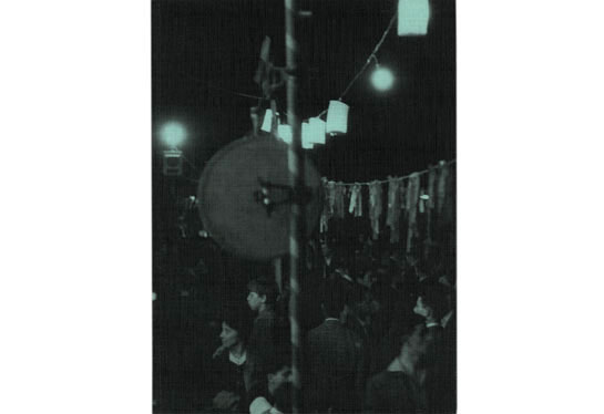
I agree, reviewing my favourite photobook this year on the very last day, two weeks after listing it in the best of 2010 list - that’s somewhat odd. But sometimes, that’s how things go. I bought the book four weeks ago, was too busy to review it, but not busy enough to add it to my list, right on top. And photobooks aren’t like bread. They don’t go stale after a few days. They’re more like wine: They tend to get better with age. In the case of Quatorze Juillet by Johan van der Keuken the book is new, the photography is not. The images in the book were taken on 14 July, 1958, and apart from a single one, they have not been published before. (more)
I admit, I’ll happily nag about the release of leftovers from photographers’ archives. We usually don’t need to see what we didn’t get to see straight away. It’s a bit like listening to all the failed, aborted, or inferior takes on jazz re-releases: Even if you’re a hardcore fan, you tend to listen to them once, realizing that there was a good reason why fourteen seconds of intro with the piano entering just a little too late had not been revealed to the world earlier. But there are the exceptions, and Quatorze Juillet is one. To a large extent this is because there don’t seem to be any inferior images: They’re all so good.
But they’re also very smartly put together. If you wanted to study how a sequence of images should work, all you’d need was Quatorze Juillet. The book shows us a few very short moments from that 14 July, 1958, taken by the then photographer, later filmmaker, of people gathering and celebrating and dancing in the street. Describing it that way makes it sounds so mundane, but what you see in the book is mundane, yet so beautiful. And you need to look, to see the little details, which make for the charm.
I mentioned this in my earlier post: As a photobook, Quatorze Juillet is a lavish production. Printed on an uncoated matte paper stock, the pages are bound in a Japanese style that results in the “pages” being sheets folded upon themselves, having double thickness (I’m no book-binding expert, but if I’m not mistaken, this is the “nori-ire gajo construction” mentioned here, with all the pages bound/glued together at the spine; the publisher’s website lists it as sempuyo-style binding). As an object itself, the book could not possibly be improved, it’s a masterful example of enormous attention to detail.
For me, the best photobook published in 2010.
Quatorze Juillet, photographs by Johan van der Keuken, essay by Noshka van der Lely, concept/design by Willem van Zoetendaal, 62 pages, Van Zoetendaal, 2010