Conversations about Photobooks: Hans Gremmen
 By Joerg Colberg
Jan 19, 2011
MORE IMAGES


“Everything that makes a book, the choice of paper, the size, the way it’s bound, the quality of the printing, the scans… everything should always be tailored to the book.” - Hans Gremmen
Designer Hans Gremmen is actively involved in creating some of the most cutting-edge Dutch photobooks. I wanted to find out what it is they put into the water that makes those books so different, so I approached him to ask him a few questions about photobook making in The Netherlands. (more)
Jörg Colberg: Dutch photobooks have become well known not only for being very good books, but also for being different from a lot of other books. Can you talk a little bit the history? Why is Dutch photobook design, photobook making different from what you see in many other countries?
Hans Gremmen: I think it’s important to see how graphic design in general was developed in the Netherlands. It has a rich history. In the 1920’s there were the great books by Piet Zwart. Later designers such as Willem Sandberg and Dick Elffers made beautiful photobooks in the 1950’s and 1960’s. They were working with photographers such as Cas Oorthuys, Eva Besnyö and Emmy Andriesse. You could say that it’s a tradition in this country. Photography has been going hand in hand with graphic design for quite a long time.
After that, the bar is already high. When people start making books in a certain way things might snowball. In the Nineties, there were a few graphic designers that really stood out. I’m thinking of, for instance, the early days of Mevis & Van Deursen, but also people like Irma Boom. I really feel that I owe them for the freedom that I have now, simply because people are used to unconventional approaches towards the medium of a book.
If the right people, with the right assignments, make experimental things then all the designers who come after them can benefit from what they achieved.
At art schools in the Netherlands, thinking freely about the medium of a book is really encouraged. I have experience teaching in Germany, and there it’s a bit more conservative.
JC: At Dutch art schools, are photographers actually working directly with designers on books, or are there designers taught to work directly with photographers on photobooks? Is that something that’s happening?
HG: No, even though at some art schools I’m sure they try. Occasionally, I get invited by photography departments to do a workshop about photobooks. Basically, what I try to emphasize is: Try to collaborate with somebody who is on the same level with you in graphic design or in another field.
I think right now most photographers at art schools in the Netherlands try to do it all by themselves, making books and everything. But increasingly, especially in The Hague, they seek collaborations with designers. And not even within the walls of their own art school, but also with professional designers. For instance, the graduation book How Terry likes his Coffee by Florian van Roekel, which is now mentioned in the “Best of 2010” Photo-Eye list, is designed by Syb, who also designed books for Cuny Janssen and Viviane Sassen.
It is great that things can work like this, and in this case it works very well. But I think many art schools have their focus too much on the professional field. Studying is a very valuable time in which you can find your own perspective through isolation. And within that bubble you find collaboration with fellow students. If the study has the focus on the ‘outside world’, students will work according to that professional field; they become followers instead of the new front runners. Also from the perspective of the graphic design student this is more interesting. When I was a student in graphic design I was really eager to find people with content to design for. For me, but I am also a teacher, it makes sense to stimulate contacts like that between students.
JC: Talking about collaborations, one of the books that I wanted to talk about is the book Fake Flowers in Full Colour that you made with Jaap Scheeren. Can you talk a little bit about how that developed? You’re listed as a co-author, and Jaap is a photographer - how did it get developed?
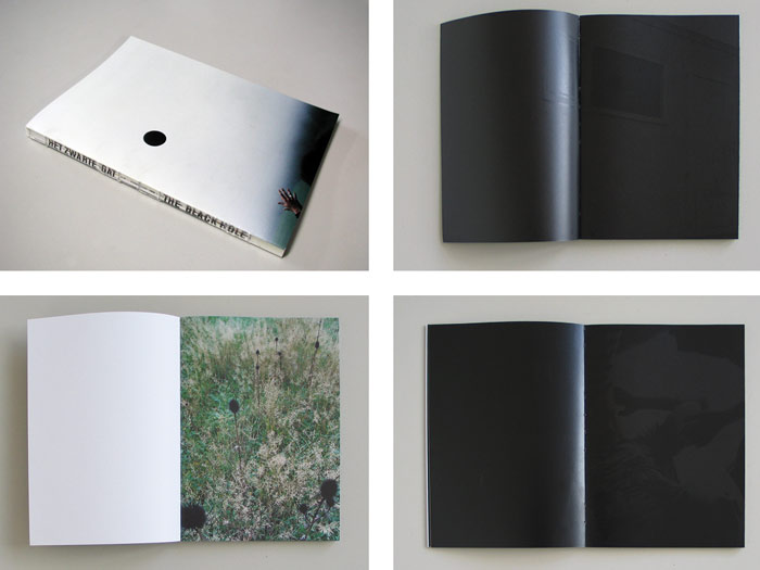
HG: That’s exactly what I meant when I said I advise students to find people that you have a certain chemistry with. One of the first photobooks I made - actually I think the first one - was The Black Hole for Jaap Scheeren and Anouk Kruithof. They asked me to come up with a concept for it. I decided it would be good if half the book was printed in black. So you’d have all the images printed first in full colour, and then half the images would be covered with black ink. Since it’s printing the images would be shimmering through. I remember being very nervous before going to present the idea, because I thought it’s brutal to say “OK, we’re gonna make this book, but you cannot really see one half.” And then both of them were so enthusiastic about the idea! That made me believe in the concept, I started to believe that we could really pull it off, which we did.
After that, Jaap and I started collaborating. We started challenging each other. So if I have an idea about a photo, since I’m not a photographer I just call him and say “Wouldn’t it be great if…” He does the same with books. He often vists my studio, saying things like “You’re really thinking about that paper for that kind of book? I don’t really know, it’s too boring.”
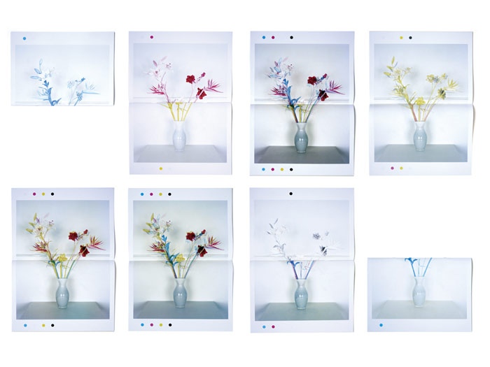
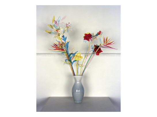
About Fake Flowers in Full Colour: on Jaap’s website there was a project where he had a bouquet of plastic flowers, which he first photographed and then burned, leaving only black sticks. The title was Fake Flowers Gone Bad. I really liked that work. And we were looking for something to do together. We started talking, and we took that work as a starting point. I explained to him how photographs are actually getting printed in books using cyan, magenta, yellow, and black inks. He thought it was interesting, that i saw the cyan image as only half a product. Because he really liked this fragmented image, and he was wondering why we didn’t consider it as an autonomous image? That is when we decided to actually create them, photograph them, and print them. That’s how it started, really by challenging each other.
JC: And the result is very striking. It’s a very unusual photobook. When I showed it to a graphic designer, at first she thought there was a mistake in the printing. She pointed out the CMYK dots at the bottom and she asked why there were there. Then she realized why and thought it was really cool what you had actually done. For me, it’s a very compelling way to combine photography with something else, which photographers usually don’t do that much.
HG: I like the reaction that the designer thought it went wrong. I feel very attracted to printed matter than went wrong. Once I made a book about misprinted posters, which I found at a silkscreen printer who makes beautiful posters. He makes even more beautiful misprints. He uses old posters to test the colours, to test the position of a new poster. So you get these really strange combinations. Beautiful objects. But you cannot do anything with them, of course, because they have the wrong information on them, dates for separate events etc.
I compiled a book, it’s called Serendipity. Out of a stack of misprinted posters one meter (three feet) high I selected 150. Then I reproduced them in a book.
JC: Here’s a very simple question - What actually is a good photobook? What makes a good photobook? What kind of books do you like?
HG: I saw the question coming, so I already thought about it. At first I thought printing is really important, or the paper, things like that. But then I thought “Oh, that book is really badly printed, but it’s very good actually.” So there always was a counter example for whatever I thought was very important.
In the end, I think the most important thing is that everything that makes a book, the choice of paper, the size, the way it’s bound, the quality of the printing, the scans… everything should always be tailored to the book. So for example, if it’s not necessary to have the book bound then don’t do it. All these decisions, all these choices (type, cover material, …) - in the end they should be fitting for the photographs or the story that is told with the photographs.
Sometimes, it’s not needed to think too much outside of the box, to make a “normal” book can be perfect. Sometimes, reaching a sort of symbiosis between photography and design can lift the work.
Take the book Elasticity by Aglaia Konrad, an artist working a lot with photography. Mevis & Van Deursen designed the book for her. In that case, the photography is already very good. The design also is, but the combination makes the book even better. It’s perfectly bound, so it opens very well. For images across the gutter you can see everything. It’s on a matte paper, well printed. It has a sort of roughness in it. It is somehow unconventional, but it’s also very clear that it’s a good book. The design is bold and direct, but it’s not getting between the photographs and the viewer. That’s a bit tricky, to make sure the design does not overwhelm the book. Everything has to fit in the end.
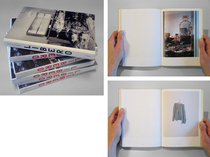
JC: A book that you presented in The Hague at the Book Case Study workshop was Libero by Petra Stavast. The book is slightly more conventional. Can you talk a little bit about your design choices there, why you made certain decisions? For example, why the wrapping that you have to take apart, and you can’t really put it back together unless you’re really neat?
HG: The wrapping was the last decision we made. The book was already printed or at the printer, so all the design decisions had already been made. On the cover, the image is in black and white. I had tried to find a way to have a colour image on the cover, but because we used a silkscreen technique it had a very rough raster. We could have done colour but then the photo becomes very obscure, looking very strange. It would end up being about the raster and not about the image. So that was not the option.
But we wanted to include a colour image. Then I thought of wrapping paper. We tried it with one book, and we immediately had the problem that you tear it apart. So you have to make a decision, do you want to keep it, or do you want to throw it away? Petra was very enthusiastic about that. Because she saw this at a perfect metaphor for the problem of memory, of family history. You either cherish it and tell it to others, to conserve it, or you can also forget it and then it will simply disappear. Besides that the physical aspect of unwrapping also refers to decay of the image. If you unwrap the paper, the image will loose quality in front of your eyes.
The rest of the book I tried to make like a regular, “normal” book, and its size was picked simply because it’s an economical size. Of course, it also had something to do with budget. We couldn’t make it bigger. But even with an unlimited budget we maybe would have ended up with the same size, because it really works. The images are quite large, but not too large, and it is a personal object. You can take it with you, it’s not like a coffee-table book. In size, it’s in between a novel and a photobook. That was our goal.
JC: Just one final thing I wanted to ask you about, which is related to something you said earlier, that the design of a book has to work together with the photography. There is a lot of talk about on-demand books. A lot of people are excited about it. But it seems the big problem is that everything is confined to very narrow selections of paper and templates. In principle there is a lot of promise for photographers who can get their own photobooks printed. But on the other side there’s the problem that all the books might end up looking the same. What are your thoughts?
HG: What I like about making a book is that it’s really time consuming. For instance, we worked on Libero for over a year. Of course not constantly, the project might rest for a week, and then you pick it back up and edit a few more pages. Another aspect is funding. I’m sometimes involved in getting the funding in order, or in suggesting ways of funding, to find a way a book can be produced. That also takes a lot of time.
Somehow I really like that these aspects of bookmaking take time. That’s because you think about what you are doing, and you often reconsider it. A photographer sometimes has to decide whether to go on a Summer vacation or to to save the money, to put it in the book, for instance. This commitment is important. There should be some risk in making a book, with print on demand nobody has to take a risk. Which makes it very random. What is the necessity of getting it there if nobody wants to invest in it?
With many books made through Blurb or Lulu I have the feeling that they are made too quickly, that somebody has an idea and instantly makes a virtual book. A week later, you can already order the book. Sometimes, that works. But often I think it’s maybe just lazy. So you don’t have to deal with the hassle of trying to find a publisher, the funding, a designer, or whatever. In that case, it’s really a pity, because you lower the bar, quality-wise.
I don’t want to sound like an old man, but with all the new media and presenting things on websites before they are actually finished… I don’t get that. Photobooks, or photographs are not a accumulation of pixels or megabites. They are real objects. As long as they are just megabites, they do not exist. They will pop up, and vanish just as quickly.
However, there are interesting things happening with print on demand. For instance with the Artists’ Books Cooperative (ABC), they are investigating the medium of photography through print on demand. And I think there could be a good market for on-demand, when it comes to re-printing books. There are some photobooks that I have really been looking for a while, but they’re not available any longer. And I often think that if someone had a pdf, then I could get my own copy using on-demand printing. Just to leave through the books, and to read the texts. Like a modern library. But that’s another issue.
The last detail about printing on demand is that the question if the book will be ‘printed’ is no longer in the hands of the maker, but of the buyer. That is a very questionable position for the maker. The ball is in the wrong corner. What would this construction mean for a sculptor or a painter? He simply has to invest in a canvas, brushes and paint, before he can work. He can’t produce a virtual sketch and say “If you like it I will really paint it. But first you have to pay for the canvas and paint.” Paint on demand. That you wouldn’t accept. It’s strange that you would accept it for photobooks.
Those interested in some of the publications presented here can go directly to the website of Fw:, “an independent organisation that initiates projects, publications, exhibitions, lectures and gatherings between photographers, writers and curators.”