Sunder Remixed
I have long been thinking about the art of the remix and about seeing it applied to photography. I have also long been griping about photobooks, about edits or sequences, occasionally done badly, but often just done in ways that I think could be done differently. Not better, just differently. Thing is, even though we’re living in a culture that has long embraced the remix in many different ways, the world of contemporary fine-art photography has proven to be solidly conservative. Maybe there is a good reason for that. Maybe I’m just too attached to a silly idea. Maybe not. (more)
You cannot look through The Photobook - A History, Vol. 1 without being amazed at how lively the medium photobook was before World War II, and how stale it has become since then. The blank-page-picture-blank-page-picture layout is still the most commonly employed mode to lay out photobooks. There are, of course, variations, both by publisher and by country of origin. The Dutch have been pushing ahead for a while, and a few major publishers have also cautiously moved towards a livelier way to make photobooks. Mind you, not all photobooks need to embrace crazy designs, but I’d really love to see more variation.
One idea I had was to remix a photobook. I’ve often thought about it, and I did an experiment a while ago. Earlier this year, I wrote a review of a photobook that essentially is merely a wooden box of prints, and I mentioned the idea of the remix. Much to my surprise, my friend Bruce Haley emailed me and said that if I wanted to remix his most recent book, Sunder, he would send me another copy. Bruce and I have known each other for a while now, and we have had many discussions about photography. Our photography backgrounds are very different, but we are firmly united in what we are interested in when we view photographs. I thought about Bruce’s proposal for a little while, and I then emailed him back to say I was game.
Why did he send me the book? Writes Bruce:
“In one of his written pieces, Joerg made the comment that he would like the freedom to take a published book and completely - literally - cut it to pieces and re-design it. I thought that sounded like great fun, and immediately volunteered my recent book SUNDER. And while Joerg is a friend, I know that my work, and the simple, traditional design that I wanted for my book, fall a bit outside of his personal tastes - so I thought that would make it all the more interesting. I sent him a copy and told him to feel free to rip the living shit out of it….”So it was on.
Here’s the big question: How do you actually remix a photobook?
The first thing I realized was the following. For me to approach a photobook and to see what I can make out of it requires respect for what it is, both for the images and for the book. In other words, remixing it does not mean it’s bad or that it needs to be improved. It doesn’t even mean I disagree with the way it’s done. Remixing a photobook means to create something different. It’s taking the individual pieces, taking them apart, and then putting them back together in a different way. A remix is a different interpretation, which involves a lot (if not all) of the original pieces plus (potentially) something else.
Looking at the book and thinking about what I had just committed to I realized that taking a book like Sunder and giving it a different interpretation has to be done very carefully. Without respect for the original a remix might easily become a travesty. The remix has to make sense within the framework of the original.
Thinking about it, maybe that requirement is too restrictive. The remix has to make sense. It can, actually it should expand the original in ways that are not included in it already. For this to work, the original cannot be one-dimensional. Taking something that is very clearly defined in one way and trying to give it new meaning might easily become a parody. The idea of the remix definitely is not to do that.
So the remix has to make sense, and it must not be a parody. There will, inevitably, be many people who will not approve of it. But as long as the remix is defendable, everything is good. The idea of the remix is not necessarily to cater to the admirers. It is to expand meaning.
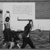
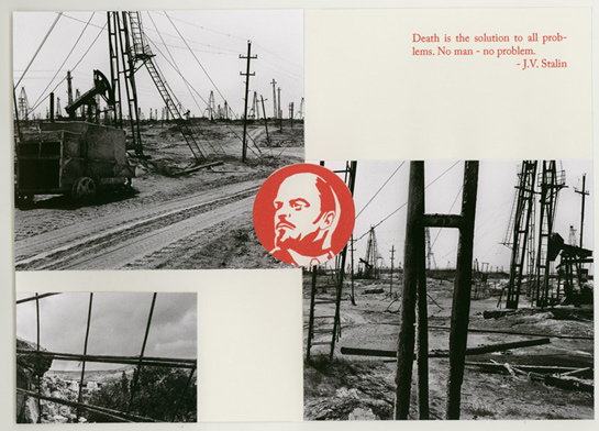
This all said, I came up with the following idea for the Sunder remix: I wanted to take the images and produce a photobook out of them that followed the ideas and kinds of layout of 1920s/30s Soviet propaganda photobooks. This would incorporate creating collages or superpositions of photographs, it would require the use of some graphic design, and I would work with a combination of text from Sunder and actual quotes by Lenin and Stalin.
The imagery in Sunder lends itself very much to this kind of treatment: The book portrays the waste land left over by the failed experiment of “socialism” (in reality little more than a one-party dictatorship claiming to be socialist). The remix is thus intended to be a bitter, biting parody of 1920s/30s Soviet propaganda photobooks, an indictment of the Soviet system.
Many of those Soviet propaganda books relied on photomontages. It thus seemed obvious that the remix should feature photomontages (this is, in part, also motivated by the fact that I’ve been working on collages for a while). I thus looked through Sunder to find material, and there was a lot of it. In fact, the different image formats used in the book (there are panoramas and “normal” rectangular photographs) provided another part of the motivation for the use of photomontages: The wide panoramas of mostly industrial waste lands can serve as backdrops for some of the people in the larger images. The figures will inevitably stick out - thus mirroring a commonly used montage style in Soviet propaganda books.
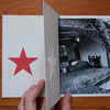
The different image formats could have posed another problem - size, but this I solved easily, too: The size of the remix is simply taken as slightly larger (only in height) than the non-panoramic photos. Inevitably, the panoramas do not fit - they are turned into accordion fold-out pages, just like in many of El Lissitzky’s books.
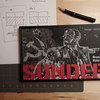
After a slightly problematic start - simple ideas how to do it needed to get refined, I ended up with a method to produce a spread. Of course, I’m approaching the remix in a weird way in terms of photobook making: I’m using an actual knife to literally cut out pages from the book and cut up photographs, plus glue to put things together. In other words, I produce individual spreads. The full book will have to be assembled from those.
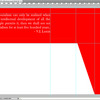
Regardless, everything gelled into the following process: Making a spread starts out with an idea. A spread can be modeled after something I saw in an actual Soviet propaganda book, or it can be based on a photograph from Sunder. The first step always involves figuring out how the photo(s) will fit into the final spread. Occasionally, the spread has to be sketched out (pen and paper), to obtain measurements to be used in Photoshop. Each spread is then designed in Photoshop. I use Photoshop for any text and for any ornamental work (red lines, bars, etc.). The Photoshop file is prepared in such a way that the image(s) “only” have to be added afterwards (in various cases, adding the photographs involves some serious work, cutting and aligning parts). The file is printed, and the photo(s) is (are) added. Often, this process has to be repeated because things don’t work out as well as they should, or I missed something.
Had I known I’d end up using Photoshop I could have just scanned the photographs. But I will admit I tremendously enjoyed cutting up photographs and making photomontages. I wanted to use red ink for the ornaments and the text, but I realized quickly doing that would require more skills than I have. In fact, even some (many?) of the graphic-design decisions are a bit bold - actual graphic designers might shudder seeing the results. But that’s OK, it’s an experiment.
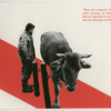
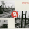
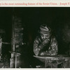
The images that come with this post show eight of the spreads, plus a couple of extra images that show part of the process. You can see for yourself whether this idea works or not.
Having done a couple of spreads I emailed Bruce scans to show him what I had done. I’ll admit I was very nervous. I liked and still like my remix very much, but I wasn’t so sure what Bruce would say. I thought it’s maybe one thing to say “Sure, cut up my book,” and quite another thing to actually see it done. Much to my delight, Bruce was very excited about it. Here is what he wrote about my results:
“I had no idea what direction Joerg was going to take with this. I suspected he would go more modern, more conceptual - away from the spare, classic design of SUNDER, which he views as rather antiquated. So I was surprised - and delighted - to see that he actually went back in time, immersing himself in Soviet Constructivist design and Socialist Realism, much like I had done when I put out my limited edition portfolio, 13 Million Tons of Pig Iron. The examples Joerg sent to me echoed El Lissitzsky, Rodchenko, Stepanova, the amazing periodical USSR in Construction… I thought what he was doing was wonderful - and although it was very labor-intensive and time-consuming, I was hoping he would re-do the whole book!”My remixing activities got interrupted for various reasons earlier this Summer, but I do plan on finishing the job. I don’t know, yet, how I’ll put all the individual spreads together into an actual book. I’ll figure it out.
Trying to come up with a good concept for the Sunder remix made me realize what a terribly complicated and hard process a remix really is. It’s incredibly time-consuming, I spent hours on each individual spread, trying to make it work.
I then spent weeks asking myself whether I really wanted to make this experiment public or not. In the end, I decided to do it. I don’t expect people to like the idea of the remix. But at least now, when I talk about a photobook remix, I can actually point at something and say: Here, this is what a remix could look like. And I really want to thank Bruce for his willingness to have his book remixed.
 By
By 