Conversations about Photobooks: Lesley Martin
MORE IMAGES
I like the dialogue that takes place around book making. I like to speak to people who know what they want, who are informed by the history of the photobook, and I think that this is possible more so than ever before. - Lesley Martin
Aperture has long been a - maybe the - beacon of American photobook publishing. It’s pretty much impossible to talk about photobooks without at some stage running into a book that was done by Aperture. Lesley Martin, Publisher of the Aperture Book Program, has worked on a huge number of those books, often pushing the envelope in unexpected directions. A few weeks ago, I sat down with Lesley to talk about Aperture and about the history and future of photobooks. (more)
Jörg Colberg: Aperture produced some of the most important photobooks of the last decades. Looking back at the history of photobook making and considering the recent explosion of independent photobook making, how has Aperture’s position as a publisher changed?
Lesley Martin: Well, we’re in the process of figuring that out ourselves, especially now that Chris Boot, who brings with him a whole wealth of other experiences—both in publishing and in other areas of the photo world—having recently joined us. It’s true, though, that the publishing landscape today operates within a completely different universe than it did when Aperture was first founded in the early 1950s with the magazine, and in 1964 when the first book was published (Edward Weston’s Flame of Recognition.).
Certainly one of the biggest shifts is that for decades, Aperture was one of the very few publishers in the US who specialized in publishing photography. There are so many now—an increasingly growing number of photobook makers and publishers—not just in the U.S. but internationally.
I’d like also like to think that Aperture has always evolved in relation to the changes at large within the photographic community itself. In the last, let’s say, seven years we’ve really tried hard to calibrate what we do in relation to what photographers are doing. It’s important that what we do reflects and responds to the concerns of contemporary photography.
For a long time, the form and design of the typical Aperture book, was pretty static as well, and I’d like to think we’ve been successful in taking ourselves off “default” in thinking about book formats and design as well. I always use the 1972 Diane Arbus monograph as the perfect manifestation of that earlier, classic form. It’s elegant, it’s simple, it’s beautiful, and it’s very much of its time, thanks to the superb, minimalist design of Marvin Israel. It features a blank page on the left, a single image on the right; blank page, image—as though you’re looking at a matted print, in the white box of a gallery space. That form became somewhat of the default mode for Aperture’s books, too—perhaps for American photobooks as a whole. And while I think this is a form that still has its value (I still use it myself sometimes), it’s not suitable for every body of work, and in particular, it’s not always suitable for the diversity found in photography today.
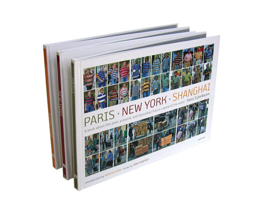
A couple of examples: Richard Misrach’s On the Beach, where the form of the book was really driven by the photographer’s practice of presenting the work at a very large scale. This type of scale had not really been part of the vocabulary of Aperture publishing in the past, so it was really interesting and important to me to figure out a way to respond to that. Hans Eijkelboom’s Paris-New York-Shanghai book is another one where the form of the traditional photobook really had to stretch to match the working practice of the photographer, as did Christian Marclay’s Shuffle (which is essentially a deck of photocards). Each of them evolved in collaborative dialogue with the photographer, the designer, and myself as editor and publisher—but each took the photographer’s practice as the starting point and inspiration.
JC: Does that mean that when you work on a book you now work more closely with the photographers and designers when making a book?
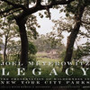
LM: My personal approach has always been to work very closely with the photographer and the designer. Some photographers will start with a portfolio of prints, others with a book dummy. When I worked with Joel Meyerowitz on Legacy, we started out with hundreds upon hundreds of little 4-by-6 prints. The project began for him as a visual archive of New York City’s parks, so the material was still in that form more or less. We worked from those, through a fairly traditional process—the development of the concept, the selection of the images, the sequence of those images, and working with the designer to implement the framework for the overall concept. Of course, Joel is so experienced and so aware of how a sequence can carry the viewer through a body of work—it was a genuine pleasure and an education for me to go through that process from start to finish with him. Increasingly, however, people come to the table with a fully conceptualized maquette and feel they just need help to produce what they’ve already put together. I’m happy working in either mode, so long as there is a strong guiding concept that I agree with and feel is right for the work—and so long as the expectations have been made clear on both sides before the process begins. Regardless of what the starting point is, however, I think it’s important to recognize publishing as a collaborative process between the photographer, designer, editor and ultimately, the printing press. Personally, I like the dialogue that takes place around book making. I like to speak to people who know what they want, who are informed by the history of the photobook, and I think that this is possible more so than ever before.
JC: There are more publishers now, which makes your position as a publisher a little bit harder. But there are also many more people interested in photobooks, which makes it easier…
LM: I haven’t figured it out—maybe you can help me create a mathematical equation to help explain the proper algorithm of photobook aficionado to sales. Our print runs remain fairly small for most books. Traditionally, the average print run has been 3,000 copies, but there is increasingly a place for smaller print runs of 2,000 or 1,000 copies, or even fewer. So the mystery to me is that the photobook audience has become more educated, more interested, more connected to the idea of the photobook—yet for the most part, sales are not shooting through the roof to a corresponding degree.
JC: I guess the numbers are offsetting each other.
LM: Yeah, probably, because you have many more choices. So if you have a budget of $50 or $60 a month to spend on photobooks you don’t have to go to just Aperture. You can go to J&L, or you can go to Charles Lane Press. You can go to Fw: and order something from the Netherlands—you can go to your site, The Independent Photobook and order something there from Japan. I think that that is very positive in some regard, because it’s creating this amazing cross-pollination of ideas, about what the photobook is, what it can be, how photographers work with it. As somebody who makes books and loves and appreciates what it takes for a book to come to life, I’m really inspired by all this creativity.
On the other hand, this is the question we’re wrestling with right now: How does Aperture—in its role as a foundation concerned with excellence across the field of photography, as well as one publisher among many—engage with this expanding world of indie publishing? How do we support this unique mode of cultural production— bookmaking? How can we facilitate a better understanding of the form? The word connoisseurship has both negative and positive connotations, but I think it’s appropriate at this time in the medium to say that there is a developing connoisseurship: How do we facilitate that? How do we help build that? How do we provide a better platform for smaller publishers who are out there? How do we shape the conversation about the history (and future!) of photography in print?
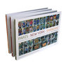
Well, for one, we publish books like The Japanese Photobook of the 1960s and 70s; the U.S. edition of Chris Boot’s Things as they Are, which is about magazine publishing; and forthcoming this fall, The Latin American Photobook by Horacio Fernandez. We’ve held panels at the New York Photo Festival, at the New School, and at LACMA, about independent publishing; we’ve hosted launches and book signings for other publishers. Also, we have the curated collection, which is a small area on our website and in the bookstore that features independently published books—like Joachim Schmid’s book series or the Chinese artist Jiang Jian’s very cool boxed set, Archive. (We have a hiatus on new titles at the moment, but this will pick up again in the Fall). It’s a little bit of a micro-distribution channel. ‘But these are baby steps; we’ve been moving slowly but surely in this direction—“curating” the photobook world, in essence. Mind you, this conversation is still very fresh and in development, but it’s an area that both Chris and I are very much interested in exploring.
JC: That might be something we’ll be seeing at some stage?!
LM: Yeah. There are a couple of things up our sleeves that I can’t get into detail about just yet, but I will say that among other ideas, I’m very interested in how one properly exhibits and displays a book. The exhibition of books has always been a funny thing—it’s a little counter to the idea of a personal encounter with a book, but there can be interesting ways to do it. I just met with somebody before you got here who showed me a really cool book dummy that would be great to exhibit somehow. These objects are really inspirational and they are useful for people to see. They’re useful for students, useful for bookmakers. But in general, I’m really interested in Aperture becoming more of a space—and a vehicle—for fostering a stronger, more engaged connection between our audience and photobooks and the ideas presented in them.
JC: Thinking a little bit about the future, what about ebooks? Are you thinking about that? What is a photobook as an ebook? An electronic photobook, what could that even be?
LM: We are just starting to play with those ideas. The first step is very obvious—it’s about words. Like, for example—Words Without Pictures, which is available now as our first e-Pub on iTunes. Essays about photography can be very easily disseminated as both “p-book “(a physical book) and in the e-pub form. We’ve already started to toy with how we can best keep collections of writing about photography in print. It’s actually very hard to do in a cost effective way. It’s a pretty niche market. A number of people who had traditionally published this sort of writing have stopped. (University of New Mexico Press, for example, was a publisher who used to publish a lot of writing on photography.)
But how we deal with images that traditionally accompany those essays or images and visual media in general is something we haven’t worked out, yet, although we are starting to experiment with and to think about. Melissa Harris, who is editor-in-chief of the magazine, is really researching that area right now. How do you make something that’s a little bit more of a multimedia experience of a photographer’s work? That’s clearly going to come together in some interesting way sometime soon. So we’re starting to play, but it’s slow going right now.
JC: You could easily imagine that some books will become available as applications on the iPad or some tablet computer.
LM: Sure—even now there are some very badly presented apps for “photobooks”, but they are more or less PDFs available for download. You can’t deny, though, that there can be something very pleasurable about the backlit screen, right? You use that as your medium for the blog, of course. And I see more and more portfolios on the iPad. If that’s the way people are thinking about the presentation of the work then at some point that’s bound to gel into something interesting.
Frankly at this point, it’s also true that one of the most interesting areas of photography is how images are being used as a sort of social glue—this is not something that is easily encapsulated in the traditional book format! So I’m looking, I’m watching. On my Twitter feed, my tag line is “Print passionate and digi-curious.” I really am curious where the digital is going. Ultimately, at the end of the day, I’m a print person. Where those two things are going to coincide is an interesting future.
And by the way - not all of the solutions are about ePubs. Digital technology is impacting publishing in all sorts of ways. Right now we have set up a few of our essay titles so that they can very easily go to short-run digital printing instead of traditional offset—so instead of having to go back to press every single time with 3,000 or 2,000 copies (which is where the economy of scale has traditionally started to make sense) we can micromanage the inventory. We can print 200 copies or 50 copies, and it’s actually doable without making the unit cost insane. That’s step one. Plus, we have done a few experiments with print-on-demand, we’ve done a limited-edition artist book with Gary Schneider, we’re doing a limited-edition artist book with Zoe Crusher. As long as we’re keeping quality and excellence as our leading criteria in working with photographers, in working with bodies of work, I don’t think we have to be too traditionally minded.
JC: In an earlier conversation about photobooks, Alice Rose George mentioned that a lot of photobooks might eventually end up on the iPad, as maybe a $10 edition. But there would be a book edition, but you would have to pay extra, for the actual, physical object.
LM: Yeah. That’s clearly already one model that traditional publishing is exploring. You can buy both the epub and the physical book. But I really believe that you have to find the right form for the photobook and its print incarnation—and the electronic version. You can’t just be throwing everything online in some crazy digital form just because you can.
I’m also interested in whether there is an interest in creating a digital reference library of the great classics of photographic literature? Is it valuable or is it just further divorcing us from this idea of the nature of print as the primary vehicle for photography?
The Photographic Universe conference that was just held over the last couple of days had a lot of interesting and surprising comments by people, coming down either for or against printed material. Richard Benson, for example saying “Forget about it. Everything that is happening now in the digital realm is better.” Literally, he said “It’s all better.” I was really shocked to hear that. He had been part of the renaissance of print, after photogravure became extinct. Richard Benson—who was Paul Strand’s printer, by the way—was one of the first to really push toward the highest quality duotone and then later, four-colour separation processes, using technology to make that process better and better. He was someone who contributed to the possibilities of a beautiful duotone on the offset-printed page, but now he’s saying to forget about all that. Maybe indigo printing, used for on demand, will do it. It isn’t there yet, but you can achieve really high quality results and its only getting better all the time! So this shift is going to happen, whether we like it or not.
JC: Let’s maybe go back to the actual printed book. When you think back, you’ve produced a lot of books. It must be hundreds.
LM: I’ve not personally edited more than a hundred … I know I’ve personally edited or shepherded at least seventy-five books over the past fifteen-years. It’s been a long time since I counted.
JC: I have this following silly question. Which of those books surprised you in terms of maybe how well they did, or how they were received? I think you probably have an idea when you make a book what you try to achieve. There must have been some surprises.
LM: There is Richard Misrach On the Beach. Our marketing staff and distributors were nervous about the size—it doesn’t easily fit on the shelves of Barnes&Noble. I knew it was going to be great as an object and was the right form for that work, but would it sell? Maybe we would produce this huge thing, and no one will buy it? It would be a huge folly. We actually dropped our print run by almost 1,000 copies. We were worried that we were going to be sitting on this book. And it sold out in four months. That’s one example.
But there are other ways of evaluating success, too, outside of the marketplace. Christian Marclay’s Shuffle, for example. Christian Marclay is much more of a visual artist in the larger art world—he’s best known for his video and sculptures but he is really attached to photography, too. I’m really interested in the way he uses photography as a visual sketchbook of sorts. We did this deck of cards with him where we took a collection of images he had shot with his cell phone and digital camera. It’s not “great photography” in the traditional sense of it, but super interesting in as much as it serves an artist’s concept really, really well. He wanted to create documentation of where sound was made visual in the landscape, meaning signage with graphic, musical notes or t-shirts or tattoos. The end result was supposed to be a deck of cards that he could give to experimental musicians, and they would improvise and play to that deck of cards. It was really fun and a great project; it wasn’t printed in huge quantities- about 2,000 copies. But it was acquired by MoMA as part of their collection (not just their bookstore!), as an important part of an artist’s practice. And it was in the exhibition at the Whitney. So that’s another type of success I am proud of. But has it sold tremendously well? No.
Actually, what I’m always surprised by more are the books that don’t sell.
JC: I guess I shouldn’t ask about those books because it wouldn’t be fair to say “Well, this book didn’t sell…”
LM: I’ll use a safe example, not a living artist. How’s that?
JC: OK.
LM: We did a catalogue raisonne of Claude Cahun’s work. Everything that she ever produced (Don’t Kiss Me). It’s historic work, with a little bit of a cult following, and our distributors were very enthusiastic about it We were very enthusiastic about it, too. We printed more than we should have, and it just hasn’t sold. It hasn’t sold half of what we printed. Historic work, everything you’d ever want to know about the artist, the decisive work about her and her work, but somehow it just didn’t go. There’s no crystal ball.
JC: There’s no crystal ball. That must make it hard to publish books, because there’s always that tremendous risk hanging over you?
LM: Yeah. We’re professional gamblers. You can mitigate the risk in smart ways, though. More and more we have to figure out how to do that, because it’s just not sustainable if you’re always risking the house on every single book.
JC: So maybe as a large part of this: What are your favourite photobooks, and why do you love them? What makes a good photobook for you?
LM: There are a lot of different ways to address that question. I’ll start by talking about some of my favourites, because it’s a good way of illustrating what I think makes a good photobook—the most dramatic manifestations of “a good photobook.”
Juan Fontcuberta’s Sputnik is one of my favourites, for example. It looks like a Russian textbook about astronauts. It’s the story of a cosmonaut, one of the first men to be shot into space. But somehow, he just disappeared, and the Russian space agency was so embarrassed to have “lost” him that they wrote him out of history, going back to any picture of him, even as a child, or later in life, standing with the great leaders. This is all a fiction, mind you, elaborately produced by Joan Fontcuberta. In all the pictures of this astronaut, Joan is the protagonist. It’s a combination of archival footage, archival space shots, archival Russian history, shots that he has put himself in and then removed, since he’s been erased, so you see the before and after. The whole object is really cool, it has glow-in-the-dark endpapers!! The design decisions, the decisions about how the text would function—you would never know that it is total fiction. It’s a perfect melding-together of a concept, of the design decisions, of the form of the book, of the intention of the book. That to me is a really beautiful thing.
That can be done in very simple ways. Chien-Chi Chang’s The Chain is another book that I love. It’s very simple, beautifully produced (I think it’s 600 line screen printing). It’s an accordion fold. It’s a documentation of a particular practice in a Chinese mental health clinic, in which these men are literally hand-cuffed together, tied together, as a way of providing care for one another. Just the fact that you can unfold it: they’re all linked together. It’s very basic, but it’s nice when the little details underline the intentions of the photographer. Simple but elegant.
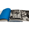
Of course, there are the great Japanese photobooks. I love Eikoh Hosoe’s Kamataichi, because it takes such a unique form. We re-issued it twice, first as a facsimile, and just recently as a trade edition. The facsimile is really astounding. You pick it up, open it, and it appears that every page is blue. But really, its that every single page is a gatefold that has to be opened to be experienced. You really have to engage. It’s a performance. It is a documentation of a performance. I like those very athletic photobooks.
I think the key is - no matter how extravagant or restrained in its design or production, so long as the photography is excellent in its own way and the concept and the form are well-considered and thoughtfully executed, I’m likely to be interested to some degree.
 By
By 