A few thoughts on The Map
 By
By 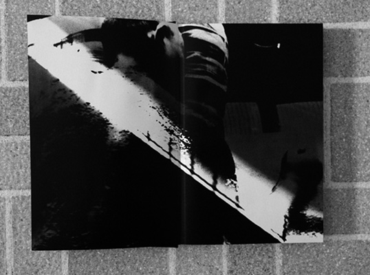


Earlier this Summer, I was teaching two classes on the history of the photobook. The second week, class was moved outside a couple of times for a more informal gathering. On one such occasion, I noticed that my mouth opened, and I heard myself state that Kikuji Kawada’s The Map (Chizu) surely was the best photobook ever made. That made no sense to me! It is not that I don’t like The Map (Chizu). But the claim that one thing - whatever it might be - is the best such thing ever made truly doesn’t make much sense, at last for me (if you don’t belive me, try one of those “world’s best coffee” places in New York City - that’ll teach you!). Not surprisingly, the part of my brain that was not involved in the talking felt a bit as if my utterance had in fact come out of the part of my body I was sitting on. Needless to say, in a class that covered 150 years of photobook history you can’t easily get away with claims about “the best photobook ever made”. So when pressed, I elaborated on why The Map truly is a stellar book. Just as before, I was surprised about the stuff I heard myself say, and pleasantly so, if I may add. Son of a gun, I thought, that’s actually kind of interesting. (more)
First things first. As I indicated I think that to claim that a photobook is the best, finest, greatest photobook doesn’t make much sense. There are many books that deserve to be viewed, and there are some that are real gems. Ultimately, if you look at the books that many people consider to be gems, they are so different that picking just one as “the best” makes no sense.
Of course, picking The Map instead of, say, Robert Frank’s The Americans is a fun exercise. It seems that literally everything that could potentially be said about the latter has been said. What is there to add? Maybe at some stage, someone might make the case it’s not so great after all, so things finally might start getting interesting again!
But still… I’d rather talk about The Map as one of the finest photobooks ever made. What does it matter if it’s the finest? What is there to gained from arguing about that - instead of talking about what makes The Map such a great book?
The Map was included in The Book of 101 Books, in The Photobook: A History, Vol. 1 and in Japanese Photobooks of the 1960s and 70s. Recently, it was re-issued in a smallish edition, which, unfortunately, is sold out (at the time of this writing, you can find copies online for around $300).
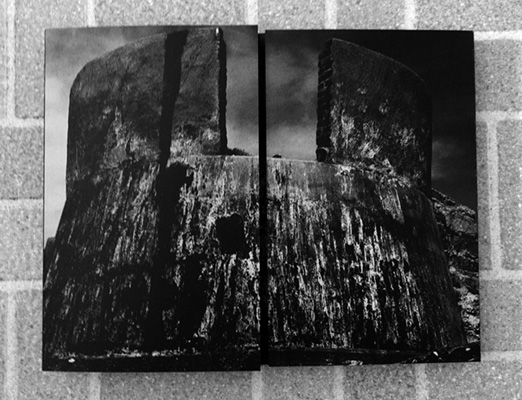
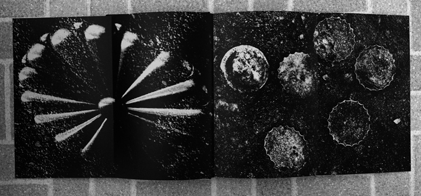
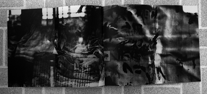
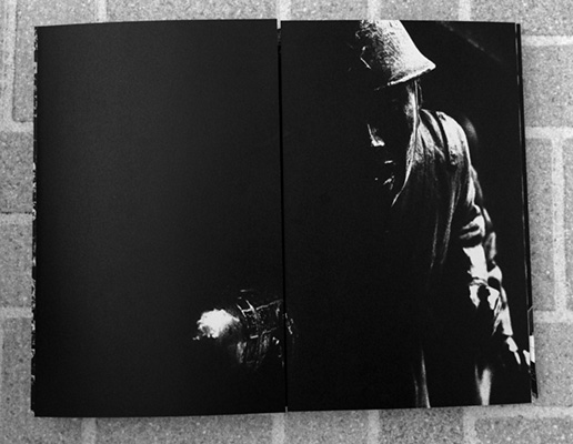
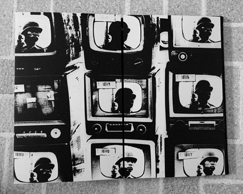
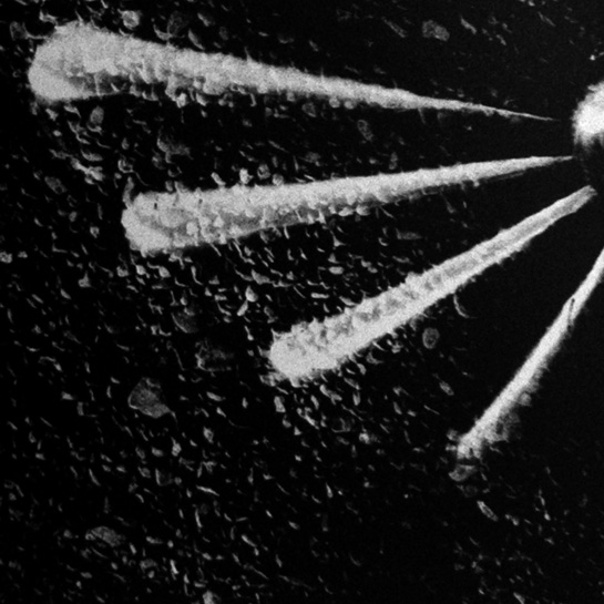
It is quite likely that you might only be able to see selected spread in reproduction (the The Book of 101 Books treatment I don’t know, the Japanese Photobooks of the 1960s and 70s is stellar). I took photographs of some of the book’s pages - these are not ideal, but they’ll give you an idea of what I’m talking about here.
What makes The Map such a great book is now necessarily what it covers - if “covers” even is the right word for what the book does. It is true, it deals with the nuclear destruction of Hiroshima - but so do Ken Domon’s Hiroshima (1958) or Shomei Tomatsu and Ken Domon’s Hiroshima-Nagasaki Document 1961 (c.f. The Photobook: A History, Vol. 1, p. 274f). What sets The Map apart is how it deals with its subject matter.
There is no such thing as a map in The Map. Or rather, there are lots of maps, but they aren’t the kinds of maps you would expect. They are images of the walls of Hiroshima’s Atomic Bomb Dome, which resemble maps. If you try to use these images as maps you will inevitably get lost - and therein I see their purpose.
Over the past decade we have moved ever more into a binary world, where there are two positions for everything, inevitably one being “good”, the other one being “bad” (or even “evil”). This wouldn’t necessarily be so bad if we weren’t refusing to realize that you cannot make sense of the world this way. There is an infinity of grey tones in between the black and white that we are so used to; for most problems there are no simple solutions, in fact for some problems there are no good solutions at all. Some problems will inevitably carry with them a combination of “good” and “bad”.
This is how The Map works. It takes you down a path and then lets you wander off, to arrive anywhere you will arrive. Even though the book is centered on the destruction of Hiroshima, it presents all the different aspects that had something to do with it. Everything is brought together, fused together, mashed up - not just metaphorically, but also visually: Images of the dome, photos of metal scraps, articles by kamakazi attack corps, the flag of Japan, TV sets, a Coca Cola ad, bottle caps… And everything literally unfolds before your own eyes: You open up an image by unfolding the outer two parts; and when you have taken it in, your own folding it back together (so you can turn the pages) brings the image back to its original, hidden state.
I’ve never experienced looking at a book quite like looking at The Map. It is not a very good metaphor, but I’m almost tempted to say that The Map is a photobook equivalent of Borges’ Infinite Library, where with each viewing of the book’s images takes you down a different path and let you see different things.
Clearly, the destruction of Hiroshima was a crime - but so was the behaviour of Imperial Japan during World War II. Which one was worse? The Map refuses to engage in this arithmetic of evil. Instead, it lets us float in a world where one evil exists next to the other, and we realize that no easy decisions can be (and should be) made. Here we have an artist who refuses to take a position - not because taking a position could potentially be detrimental to his career, but because taking a position makes no sense here.
I have the feeling it wouldn’t be such a bad idea to learn something from how things are presented in The Map: A book almost entirely consisting of black and white tones, with no shades in between, teaching us about the grey areas in life. This doesn’t mean that there are areas where there is a clear good and bad - but it’s important to realize that those cases might be less common than you think.
The Map’s visual complexity reflects life’s. It presents photography not as a way to make things clear, to single things out, but to do the exact opposite.
As much as I’m looking forward to seeing photobooks brought to electronic devices, there is no way that The Map would work on one of those. Your own moving the pages, folding and unfolding them, turning them over, is part of the experience of the book. If one ever needed to make the case for the photobook as a physical object, all you’d need was The Map.
Here is something else that is striking about The Map. Can you name a German photographer who has dealt with the past in the way Japanese photographers have? Maybe I’m missing something, but while Germany’s non-photographic artists have dealt with the German past, its photographers, curiously enough, for the most part have avoided the subject. This is all the more striking since Germany as a whole has made tremendous efforts to deal with its past - unlike Japan, whose prime ministers until very recently regularly visited a shrine honouring war criminals, but refused to even apologize for the country’s action during World War II.
This all said, there is only so much that can be expressed in words about The Map. Ultimately, you have to experience it yourself. It showcases photobook making at its finest, in a way that you don’t get to see very often.