Review: Memory Traces by Cary Markerink
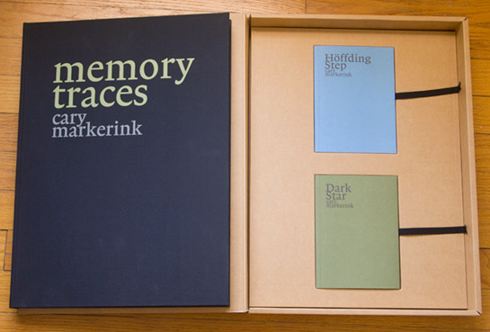
I’ll admit: I wanted to like Cary Markerink’s Memory Traces so much, especially after reading Hester Keijser’s (somewhat gushing) two-part review of it. But I just ended up being incredibly torn. It might seem slightly unfair to start a review this way, but the moment you hold the box, the object’s physicality muscles itself into the center of your attention. There are three books that come in a box, two smaller ones and a massive, oversized one. Marc Feustel, in his review, called the project “outrageously ambitious,” and if anything - that it is. But the crucial question, at least for me, is whether the content matches the size of both ambition and the main book. (more)
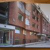
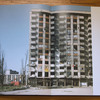
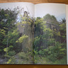
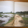
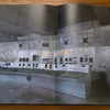
Memory Traces pretends to deal with landscapes, but in fact it doesn’t. The landscapes in the book are used as jump-off points to dive into the things that are there, but that cannot be seen, the things that can only be felt. Across the globe, we get to see places as different as Sarajevo, Hiroshima and Nagasaki, Chernobyl or My Lai (there are more). Provided you have at least a rudimentary education you will be familiar with the history of most of them. How has what happened in those places embedded itself in the landscape? Well, has what happened there embedded itself in the landscape? To ask a silly question: Where or how exactly do we see history? In fact what is history?
And this, in essence, brings us to the core of photography itself, because ultimately photography always does just that: Present us with what it pretends to be a trace of some sort of history, whereas in reality all that history is just made up, by us, when we look at a photograph. I love Markerink’s ambition to produce a book about this. The two smaller books - one “only” filled with writing, the other one containing found photographs from Chernobyl - are true gems. The big book, however, is where things start to fall apart a bit.
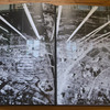
I already mentioned the sheer size (30,5 x 41cm or 12 x 16in) - an unwieldy and ultimately uninviting object. Physicality aside, the book’s main flaw is that while it pretends to employ size and design for effect, that effect is never fully to be had. The size and design overwhelm many of the nuances, and they make you look in the wrong spots for the wrong things. After a while, you get lost - but unfortunately not lost in the sense of trying to understand the connection between memory and history and places and images of places, but lost in the sense of what you are supposed to make of the book’s construction.
The design of a photobook, after all, must never get in the way of the book’s intent. In this massive book, it unfortunately does. The design (the gatefolds and the reduced pages) might make sense in terms of catering to the photographs, but it does not necessarily make sense in terms of someone interacting with the book. If the interaction ends up focusing too much on trying to make sense of the design - instead of using the design to showcase the photographs - then there is a problem.
That said, I do find myself coming back to the book, despite its flaws, because it does offer such an interesting perspective on both artistic ambition and on a subject matter that will forever remain fascinating to me. In terms of the questions it asks, Memory Traces is a bottomless pit (the moment you think you got some firm ground it’s gone again) - throwing the viewer/reader into confusion and making her/him think in ways that are not that common in the world of photobooks.
Memory Traces, photography and text Cary Markerink, design by Irma Boom, self-published/Ideas on Paper, 2009

