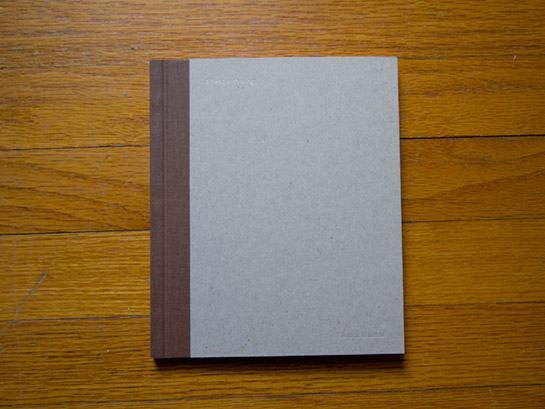
Review: A Head With Wings by Anouk Kruithof

It’s an old question: How do images work with text? According to what we could call photobook orthodoxy, interestingly enough established after photobooks had been very lively affairs (see Parr/Badger - The Photobook: A History, Vol. 1), there has got to be no text alongside photographs other than a page number and (maybe) the title. When well done, such books work well, but it is also rather obvious that it is pressing many photographic bodies into a formalistic straight jacket that ultimately diminishes what could be had. (more)
I’ve written extensively about this topic here, so I don’t want to repeat myself ad nauseam. I think by now we’ve seen enough examples that deviate from photobook orthodoxy to realize that there is a lot of (new) life in this medium. In fact, I am happy to argue that one reason why photobooks have become so popular over the past few years is because more and more photographers have been willing to produce photobooks where the format supports their work - instead of the other way around.
I’ve also written about Dutch photobook-making a lot. There has been a bit of a pilgrimage to Holland to see what you can do with a photobook. I’m seeing more and more examples of the ideas of Dutch photobook spreading across the globe - very slowly, of course (photographers are a very conservative bunch), but steadily.
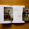
Anouk Kruithof’s A Head With Wings (text and images by the artist and design by Hans Seeger), published by Alec Soth’s Little Brown Mushroom imprint, can be taken as a good example of exploring the medium photobook by pushing the boundaries. The first thing to note is that the book relies on text as much as it relies on images. The text - “a hallucinatory yarn of anxiety and desire,” according to LBM - could be thought of as the handrail that guides the visitor of this photographic funhouse. The images often have to be literally discovered by unfolding them (this review comes with a couple of example spreads that show you what you will find).
The act of unfolding is crucial. You unfold, and then you (have to) re-fold to turn the page (As an aside, A Head With Wings could serve as a great example of what electronic photobooks could never hope to achieve). But of course, everything has to work together. The design must not overpower the rest of the book - aka the story and the images. For the most part, I think this has succeeded. But I can’t escape the nagging feeling that at times things might have been pushed a bit too far.
This little concern aside, I’m very excited about the book. The possibilities and the promise of the medium photobook are shown very clearly. Kudos to Anouk Kruithof and to publisher Alec Soth for fearlessly pushing the boundaries!
A Head With Wings, text and images by Anouk Kruithof, design by Hans Seeger, 28 pages (of various sizes), Little Brown Mushroom, 2011
(for those interested, here is my video presentation of the book)

