Review: Transmutations by Johan Rosenmunthe

It is no secret that I am very interested in artists who expand the medium “the photobook.” There is a lot of talk about “ebooks” now, but it seems way too early to tell where this is going. We’ve just made it past the wave of the first ephotobooks, and I’m not sure whether what we’re offered right now is what the ephotobook will eventually gel into. In retrospect, the video-game “Pong” offered a lot of promise, but I think we can all agree that while it’s still very cool to see, it doesn’t really tell us all that much where the genre “video game” went (it’s a curious - and sad - path from the geeky primitive paddle game to today’s ultra-violent “ego shooter” games). What is more, while I do appreciate the push towards the “e,” I do think that the photobook itself still can be developed further in all kinds of interesting ways. We’ve witnessed a lot of those over the past few years, as, to give just one obvious example, designers in the Netherlands have shown the world that a photobook can be quite a bit more than just a bunch of photos on paper. (more)
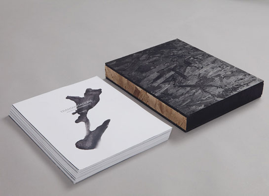
Strictly speaking, Johan Rosenmunthe’s Transmutations is just that - a bunch of photos on paper. In fact, it is literally just that, a stack of pages, with photos printed on them, that come in a wooden box (see this video). The good thing about all those ebooks, of course, is that the old complaint “How is this a book?” doesn’t even work any longer (unless you want to be incredibly conservative). So we don’t have to really deal with the fact that the pages are not bound. They do come in an order, but if you feel like doing that you can mess that up as much as you want and create your own order. And why wouldn’t you? If you can you might as well do it, because, and this is why I’m saying that, it’s probably a good assumption to think that the makers of the book have thought of that (the idea that the makers of the book might read this review, look at each other and mutter “Oh shit” amuses me, though).
I’ll admit - I find it refreshing that I can mess with the book. If you’ve followed this blog for a while you know that I tend to have my opinions, and you won’t be surprised to learn that often, I wish I would just take that X-Acto knife to a book, separate the pages, trim the excess fat and reshuffle the rest. I don’t do that, of course. But at times, the temptation is strong. The Dark Side is beckoning.
I suppose as a publisher and/or photographer you don’t want to hear that. I understand that: You work on an edit and a sequence, and things are done for a reason. Also, isn’t it the artist’s role to define her or his work, to say “this is what it is, now deal with it”? Well, of course, it is. But that temptation…
Given that I’ve probably ruffled some feathers already I might as well take the ball and run with it a bit more: Sometimes, I think we do take the artist too seriously. Why can’t I remix, reshuffle a book? What if I was able to extract a new, additional meaning to it? Oh, you might say, what if that’s not what the artist wanted? What if there is that one meaning, and that is the meaning? But would it be so wrong to find new depth, new - additional - meaning in a body of work? Isn’t that what you want as an artist?
Regardless, Transmutations let’s me do whatever I want to do, and I like that. I think I might frame an image or two and re-shuffle the rest, to see what I can make out of it: My very own experience of this work. Beautiful.
Transmutations, photographs by Johan Rosenmunthe, 64 (loose) pages in a wooden box (individually crafted), Vandret Publications