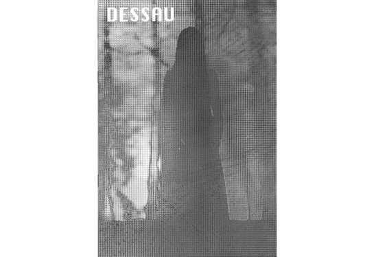
Review: Dessau by Bill Sullivan

There’s an ongoing debate about how much text you need alongside photography, with the spectrum ranging from those who say that photography should speak for itself, whereas others prefer to see a statement. This is not necessarily the most exciting debate to begin with (it’s rather old, too - even though the age of a debate does not say anything per se about its actual merit). Occasionally I find myself asking that question when I find some work without any text, and I wish there was some. As far as I can tell, whether or not some photography needs text or not does not depend on one’s preferences, but for the most part on the photography itself. In the case of photobooks, there typically is less of a debate, since most photobooks come with the obligatory essay (which people then might or might not read). (more)
In the case of Bill Sullivan’s Dessau (you can digitally pre-view the whole book here) I found myself in the position of Buridan’s ass, being unable to decide whether I wanted some text or not. I eventually decided I needed at least a little bit text to find out about the title (equally obscure pop-culture reference: spontaneous symmetry breaking) and found the following: “Citing the advantages of the small town among other reasons Walter Gropius and its other administrators transferred the Bauhaus from Weimer to Dessau in the spring of 1925.” Now that just makes so much sense!
But I don’t want to harp on cryptic book titles, because I like this little book (I suppose it files under “zine”) very much. When I heard about it, I had an inkling I’d like it - given that I was familiar with the imagery - and it’s only 5 Euros (which, at the time of this writing, is around US$7.50). That’s a steal!
I will happily admit that I have been dreaming of finding a small treasure like this for a long time. I typically go to a photobook store, and there are lots of treasures, but usually they’re sold as such. Make no mistake, I do value a great photobook, great printing, great binding etc. And you could imagine a version of Dessau on glossy paper, with the usual blank page-picture-blank page-picture layout (plus the obligatory essay by some highly theoretical art critic). But as this little zine shows, you don’t have to have that. This zine just feels right. This zine is all you need.
What exactly I’m looking at here I have no idea. Various of the images seem to be taken from Duane Park. What I do like is how all the images constantly seem to battle with each other, and a lot of them look as if they were literally being taken apart. And all of this is done in a very smart way.
Unlike many other zines, Dessau also feels more complete and less random. As much as I enjoy looking at zines, the sheer randomness of many of them drives me crazy: Something that looks as if it was slapped together in, let’s say, three or four minute rarely makes me want to look again. I guess I’m a bit old-fashioned that way. Dessau does not suffer from that problem. I’ve been coming back to it for a few days now.
Recommended.
Dessau, photography by Bill Sullivan, 32 pages, Kaugummi Books, 2011