Two zines

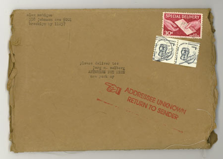
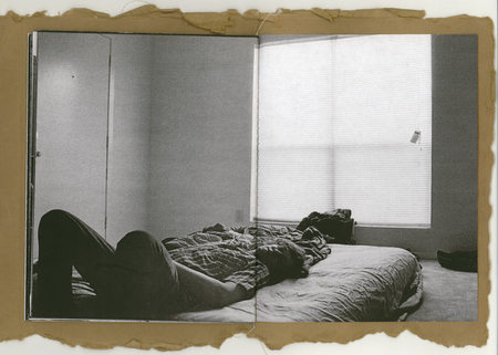
I got an envelope in the mail, from “A.M.”, Brooklyn, and of course, I didn’t remember anything about it. I order a lot of books online and have them shipped to me via media-mail, which usually means a delay of at least a week. Occasionally, someone will email me and offer me a copy of a book, and I usually forget about that, too. I’m not senile (I think), I just remember other things (often things that are entirely useless, I wish I had this under control). In any case, the envelope contained a hand-made zine, with the cover made to look like a very old letter (see above); and the inside contains b/w photography.
 There’ll be enough people who’ll hate me for saying this, but regardless, it’s the kind of photography that I never look at much online. But here’s the thing, presented this way, it has more additional qualities than just the tangible one (click on the above image to get an idea). I like things to be a bit neat, so the loose thread is driving me crazy - but it’s also part of the experience. I love it.
“A.M.” stands for Alex McTigue, you can view the zine here (it does look way cooler when it’s not on the computer screen), but you really just want to order it - it’s a steal - via this page.
This has me wondering what all those who are so eager to see photo books on iPads or other gadgets would say about this. What’s a zine on an iPad? I mean, what would be the point?
Of course, I could think of a lot of photography that would look great on one of those electronic devices, but there is also a lot that will look like crap. So there’s the future of the photo book: It’s going to be books, real books, made out of real paper, often even hand-made.
Maybe I’m channeling my inner Jaron Lanier too much, but especially photo books are more than just some contents to be distributed in a uniform manner. Will we end up in a world where just as every Facebook profile looks the same, all iPad photo books will end up looking the same? This is one of Lanier’s points (people like to quote the phrase “digital Maoism”, but they never explain what he really means by that), that places like Facebook do not promote individual creativity - even if you add a lot of your personal details (which will probably differ from everybody else’s), your profile page will still look like everybody else’s. In the book world, you can already see this happening with Blurb, where there’s a narrow set of standard templates, and people fill those. One image here, one image there. You don’t need a hand-made zine to show what’s at stake, but, seriously, it drives home the point.
When I started to look into independently produced photo books - largely as a reaction to being bored with gallery shows on paper (see this post and this one) - I had hopes a new world would open up to me, and I’m glad it’s happening.
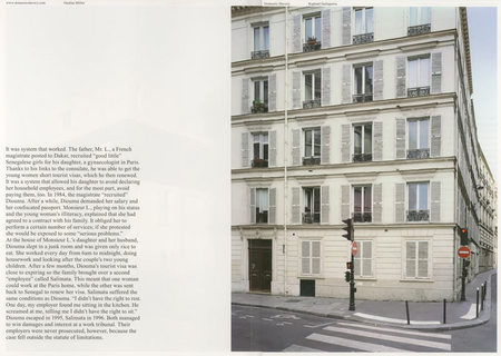
 I also received Fotodok’s publication of Raphael Dallaporta’s Domestic Slavery in the mail. You could maybe call this a high-end zine - it’s not even bound, but a lot of design has gone into making it look very neat and clean.
 Click on this image to see the bigger layout of the page.
Alex’s zine and Domestic Slavery occupy opposite poles of what one could call the spectrum of zines. While they look and feel very different, what they have in common is a dedication to producing a genuine outlet for some photography. In both cases, the form does follow the function a little bit, and in both cases there is proof that bored photo bloggers like myself notwithstanding the medium photo book is very much alive.
I’ll keep talking about the photo book in its many variants here; that’s part of what “Photo Book Friday” is about.