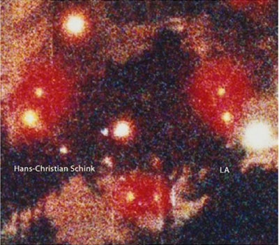
Review: LA by Hans-Christian Schink
 Being familiar with Hans-Christian Schink’s wonderful Traffic Projects
 (see some of the images from the book here), finding LA
was a bit of a surprise for me (even though I should have known from his most recent work - examples in the top row on this page that Schink is not a large-format one-trick pony). LA
of course depicts Los Angeles, and it does it in two different ways. The first is similar to what Schink did with his German highway construction projects: Large-format photographs of deserted places against a grey, blank sky. I’m not that familiar with LA (but familiar enough to say that I could never live there), but I wouldn’t have expected to see photographs of that city without anybody (incl. only parked but no moving cars) around.
A foreigner coming to another country for a limited period of time (Schink spent three months in LA, using a stipend) and then taking photographs is always a bit dangerous: It’s just so tempting to show what you think or expect to find, namely clichés (for an example see Peter Granser’s “Signs”). And there is no shortage of clichés in LA, isn’t there? Hollywood, cars, Venice Beach, sunshine, what have you. Schink’s LA doesn’t have any of that. I showed the book to someone who had lived in LA, and he was mesmerized seeing the city he knew fairly well in such an unusual light.
But there’s more. In addition to the large-format views, there are other photographs: Extremely grainy images, taken at night, obviously just small parts of larger images, blown up to large sizes (the cover image is an example, and you can see some of those images here). It’s almost as if Todd Hido went “house hunting”, putting his camera somewhere up at night, to then cut out the small houses from the large images. I know, analogies always simplify things a bit too much, but you get the idea.
I was frankly surprised how beautiful many of those images are. I have a little theory and I don’t know whether it’s true. When I came to the US I noticed that at night, things looked very different from what they look like at night - due to different kinds of light used to illuminate the dark. US cities struck me as weirdly orange and strangely colour-less - compared with the kinds of illuminations I was used to when living in Germany (German street lights have a cold, white-blueish cast). My theory is that Schink might have had a similar experience, which might have made him zoom in from larger frames. Who knows?
Regardless, LA combines two small bodies of work by a German photography who seems to be flying a bit under everybody’s radar. It’s a beautiful book, very nicely produced - and if you love (or hate) LA it might just be the book for you.