What you see is not what you get
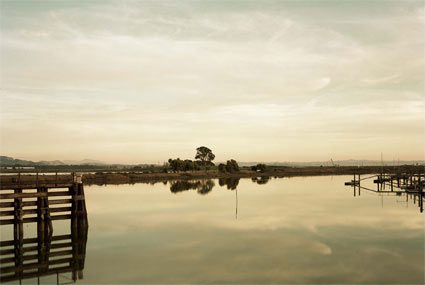
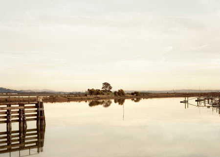
The day after my Elger Esser post Christianne Dearborn from Lapis Press emailed me and told me that the image that I had used (top image, which I had found online) did not have the correct colours (thank you!). A much closer representation of what the photo looked like was given by the bottom image.
As much as the internet enables showing photography and talking about photography, this is something that everybody should be aware of (just as an aside, this problem is not new: If you compare reproductions of art works and/or photos in different books, you can usually see pretty large differences, too - all that pre-internet). What you see online is (typically) not what you get when you see an actual photographic print (also compare the following recent posts over at Hippolyte Bayard and Mrs. Deane).
In reality, what you get after seeing it online might not only look different (colours and contrast shifted, enhanced, etc.), it might look better, or it might look worse. I often encounter people telling me that the web is a bad medium for photography because of this. My standard response is that you could show me a Diane Arbus photo reprinted in a newspaper and it would still be a fantastic photo. Maybe that would be a good criterion for What makes a great photo: If the photo still looks great if you print it in a newspaper it’s a great photo.