Some more thoughts on the visual language of photojournalism
My earlier post about the visual language of photojournalism needs to be clarified in many different ways, and I hope to be able to add a post here and there that will talk about some more aspects. I thought I’d start off by giving an example first.
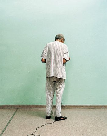
The following two images both deal with mental illness and the institutions mentally ill patients live in:


The first image is from Alex Majoli’s ‘Leros’. The second example is from Adam Broomberg and Oliver Chanarin ‘Ghetto’.
I need to stress that what I’m after here is not which of these images I prefer as a matter of taste. I’m interested in talking about the visual language they employ. Alex Majoli’s image follows the foot steps of classical photojournalism. It’s b/w, grainy, and it’s literally in your face. Adam Broomberg and Oliver Chanarin is pretty much the complete opposite. It’s a colour image, fairly strictly composed, and you the person this is all about is turning away from you. It’s probably not hard to guess which image I think works better as photojournalism with today’s audience.
Make no mistake, this is not about which is a better photo. It’s not about who used the better camera. It’s not about who is more concerned about the subject matter, because I do believe that both Alex and Adam/Oliver care very deeply. It’s about how people react to the work, in the light of the cultural context of this early 21st Century.
We live in a day and age where images are bombarding us, and many of them are designed to manipulate us, be it advertizing or cable-TV news (which, while claiming to be fair and balanced, is anything but fair and balanced). There are two ways to deal with all of this: You can either turn off completely and move into a cabin in the woods, or you can develop a mental mechanism to deal with all of this. Most people seem to go for the latter, and I think it’s very easy to observe that mental mechanism at work every day: Most ads you don’t see any longer. You simply ignore them. You filter them out. When ads start you change channels so quickly that - if you think about it - it’s astonishing how well you got it down. There is a reason why TV (where these mechanisms are vastly accelerated) changes its presentations of programs so rapidly: People adapt, and the tools become blunt. Actually, when you now watch a program from the 1960s the old mechanisms start working again: Things look so weirdly static - where is all the moving stuff?
On top of that, what I want to call classical photojournalism has now become part of our photographic canon. I am happy to argue (going on just maybe the slightest limp here) that that also changes the way we perceive such work, in that it might not strike us as dealing with something that we have to deal with today any longer. It’s a bit like listening to really old-school blues music: While there is a very strong message, these days you might actually take the message somewhat more seriously if it was presented in the context of hip-hop, say.
And I think all of this is at play here, making classical photojournalism a somewhat blunt tool. We react to these images in a way that makes it harder for their creators to reach us. It’s not because of the message, it’s because we react to the packaging in a certain - yes, call it jaded (even though that’s not it) - way.
(more to follow at some stage)
Update: Maybe a good way to think about this all is to think in terms of “visual sophistication” (a term Roger Richards just used in an email to me). In that sense, we all are becoming more and more visually sophisticated since we have to adapt to an ever changing visual environment. I’d really hate to have this effect seen as a dumbing down (as tempting as that might be for cultural pessimists), even though this increasing visual sophistication is in part caused by sites/channels some of whose message isn’t very sophisticated at all (think MTV).