The Pitfalls of Self-Published Books
Given all the brouhaha over self-published books (or, more accurately, books on demand) I thought I’d give it a shot myself. I have been taking Polaroids for quite a few years now, and finding them sit in some box somewhere the other day I thought I might as well take the best ones (my personal favourites that is) and compile them into a little book, just for my own entertainment and maybe to give it away to close friends.
(Updated on 23 25 26 Aug 2008 - scroll all the way to the bottom for the latest update)
Polaroids, of course, are special kinds of photographs in the sense that from a purely technical point of view, they usually leave quite a bit to be desired. Even though the “Spectra” camera/film that I use is of somewhat better quality, it still has its idiosyncrasies, such as a soft spot in each photograph (somewhere in the lower left corner); plus the colours almost never resemble what you see in real life. In other words, a perfect project for the “good enough is good enough” maxim (because, after all, if the colours are a bit off because of the scanning and printing, who would really know, right? - let’s hold that thought…)
So I scanned and spotted a total of 37 Polaroids (scanning them at 300 dpi, with the idea of having the images reproduced at their actual size), and I assembled them into a little (7” by 7”) softcover Blurb book, which resulted in a total cost of $28.32 (inc. shipment - I removed the Blurb logo from page 3, and I never fully understood whether that increased the price or not). Simple enough.
A few days later, my little booklet arrived in the mail. What can I say? While on the outside everything looks fine (apart from the fact that the image on the cover is stretched slightly), the images inside the book look like crap. They look like something printed on an extremely cheap printer, with a strong magenta cast and all kinds of other problems (incl. muddy-looking images). When I showed the book to my wife - a professional graphic designer with over 15 years of experience - she confirmed what I was thinking.
“OK,” I thought, “you get what you pay for,” and I was going to forget about the whole experiment. A few days later, I talked to some of the participants of the workshop that I had organized with my friend Robert, and there were several people who could confirm my experience. The general consensus was that the little Blurb softcovers had to be avoided.
This whole episode left me a bit annoyed, though, because, after all, what is the point of print-on-demand if you have can’t get little books done? If in order to get a decent looking book you have to fork out significantly more money to get the better printers? And given that so many people told me straight away “Oh, no, you definitely don’t want to use the little Blurb softcovers!” why haven’t I come across this online before?
A few days later, someone suggested I try MyPublisher, which, if I remember correctly, I had used once four years ago. At that stage, I thought I might as well go for it and then write a blog post about it. The company’s name always evoked weak Seinfeldian connotations (“Muffin top to you!”) for me, but that was no reason not to give it a shot.
$28.25 later it was time again to wait for the booklet, and I got it in the mail today. Apart from the fact that all the images are now larger than their original size (that wasn’t supposed to happen), the difference in quality is quite obvious. While the covers are comparable (Blurb’s is glossy, MyPublisher’s is matte), the reproductions of the Polaroids are vastly better in MyPublisher’s case. No colour casts, and the images more or less look like what they’re supposed to look like.
To compare things, I scanned the covers of both booklets and the page that contains the cover image and put it next to the original scan:
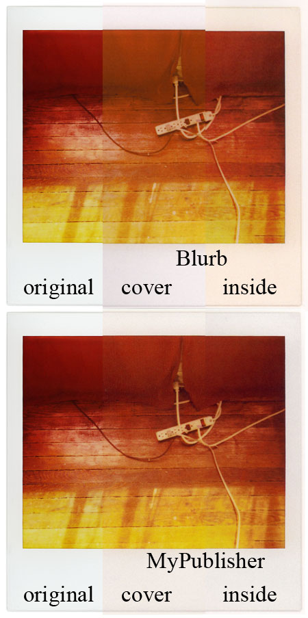
The top and bottom rows are Blurb and MyPublisher, respectively. The left-most third in both rows is the original (source) image (which I had sent to the publishers), the middle third is the scan of the covers, and the right-most third is the scan of the inside images.
Despite the small image size on the screen, you can see the Blurb colour cast fairly easily (it’s quite a bit worse in other images btw), but the sample image conceals the overall muddiness of Blurb’s booklet. Of course, one could argue that my procedure of scanning etc. leaves a bit to be desired, but if you looked at the actual books you’d see that the example above actually makes the Blurb booklet look much better than it actually is.
Of course, having one book done is not a very scientific way to go about things. On the other side, I simply would not have expected such bad quality from Blurb. And that’s what this all comes down to for me. I contacted someone at Blurb a few days after receiving the book, and he recommended I contact customer support. Customer support already asked me to send them an image of what the problem is, so there might be a solution for my problem - but again, a printer with lousy image quality will always be a printer with lousy image quality, and it’s hard to see what can be done about this (other than getting better printers). Oh, and I wasn’t going to spend that much of an effort on this all.
I do realize that in these days of the internet this post might result in the usual hyperventilations, and it’s probably futile for me to say that that’s not what I’d like to this to turn into.
What I do want to point out is that while printing books on demand might sound like a great idea, it is ultimately up to the photographer to perform quality control. And getting books printed on demand might in fact lower the threshold of the quality of photography books to a noticeable extent - something that I’m very much opposed to. As simple and inviting it is to get a book done quickly and maybe cheaply (but, as we’ve seen above, not too cheaply), anybody who gets an on-demand book will do her/himself no favour at all if the book leaves quite a bit to be desired (especially if the book is then used for publicity purposes). And this extends from the quality of the printing to the editing of the book.
I do think that on-demand printing of books opens up great opportunities, but I also think that it requires much more work and attention to detail than most people would think.
PS: In all fairness I should probably get my book made by other on-demand printers (because with only two it’s not obvious which one is the more typical experience), but despite the relatively low cost of those booklets it’d still cost me too much money. If people want to email me some of their experiences I’d be happy to publish a selection here (I’m happy to quote people anonymously).
Update (23 Aug 2008): Reader C.B. emailed me about his experiences with Lulu.com: “First, the colors were quite odd, what read a cool white in Photoshop (very little saturation) came out as a pale green, and conversely the shadows (still slightly cool in the file) were tinted magenta. Midrange and more saturated values came out closer to my images, but I think overall the images were too cyan/green, oversaturated, and the print resolution wasn’t that great (but acceptable I suppose).
“The first batch (I ordered 3) all came with dented covers, front & back… they replaced that batch for free, but wouldn’t accept a tweaked file to correct the color, though I was hoping they would print it from a different printer (they outsource to a number of printing companies across the US) that would give better color, unfortunately they just came with nearly the same color problems & no dents. So I ordered another batch, mostly turning down the saturation but also tweaking color balance… the results were better, but still unacceptable to produce a run I would feel ok distributing… Ive talked with a few people who have used other services and haven’t heard of a truly positive experience yet.”
I also received emails with links to other people testing and/or commenting on on-demand quality (thank you!). Luke Tymowski sent me the link to Dave Beckerman’s experience with getting on-demand b/w books. Note that from what I’ve heard getting a good b/w book is even harder than getting a good colour book. At the workshop, someone had a pretty decent looking Blurb b/w book, and he immediately got asked how he had managed to get something without a strong colour cast.
Oh, and as an aside, someone else told me that there is a marked difference between US and European Blurb books - I forgot the details, though.
I do want to stress, though, that the quality issue separates into (at least) two parts, the first part being the actual technical quality of the printers themselves, the second part being colour management. Shitty printers will give you shitty prints, no matter how careful you are with colour management. But good printers will give you good prints if the colour management is done correctly.
I cannot and will not pretend that I’m an expert on colour management issues (even though I know what to do to get excellent prints of my own photography). Sébastien Orban emailed me a link to a page that discusses a test document for Lulu.com. This, of course, points into the right direction. In theory, anyone doing a book would probably want to test the publisher first and then carefully work with the results - something that, in practice, is probably not done very often.
Andrés Marroquin Winkelmann emailed me the link to Book Publishing and Color Management with Blurb, which contains a lot of useful information, the vast bulk of which might or might not fly over many people’s heads. But this is really what book publishing (or getting good digital prints) comes down to: Extremely careful colour management, which, in the end, means making sure that the output files are generated for the printers they will be used on. As a little consolation for people: I’ve seen digital prints in high-end art galleries that were terrible (I won’t name any names, so don’t bother asking via email) - getting good digital prints is significantly more complex and difficult than most people realize; and I find it slightly surprising that while many photographers - especially those who grew up before the so-called digital revolution - know the names of expert analog printers, there does not appear to be a corresponding pool of expert digital printers.
Coming back to my little test, I did use the sRGB colour profile recommended in the last document, but from what I’ve heard the Blurb softcovers are not printed on good printers anyway.
I’ll keep updating this post as long as I get new information. But as you can probably see already, if you think on-demand publishing is an easy way to get a high-quality book you might want to think again. In the best case, you’ll spend a very significant amount of time and money on everything - and then it’s very worthwhile to ask why you wouldn’t do real self publishing: Getting pages printed and then either binding the book yourself or having it bound by someone. That’s what I will do with my personal work.
With simple and cheap “good enough is good enough” on-demand printing you get what you pay for.
Update (25 Aug 2008): In a comment over at A Photo Editor, Ian Aleksander Adams elaborates on an issue I mentioned in passing above: “Not only are the printers different, each book is shipped out of a different plant. If one is ordered in the uk, it might be a different printing process altogether. Sometimes a book will show up with a big barcode on the back page and cover.” And: “not only can the quality be bad in a book, the overall quality is not dependable: I’ve had some small books look absolutely amazing and some have the kind of color shifts he describes or worse. The ones you saw that seemed fine might be at the top of the curve.”
Update (25 Aug 2008): Someone emailed me this experience with Blurb (and I’m starting to see a pattern here, given all the other things I’ve heard): “Last spring, I produced a Blurb book to get a sense of the quality. I bought one hardcover book for myself, and I was so shocked at the poor color reproduction that there’s no way I would be comfortable selling it on demand. As an example, on the two inside flaps of the dust jacked, I had a white background and black text. Pretty straightforward. Except that the text showed up a definite brown. The colors throughout the book weren’t as bad as they were on the cover, but they had screwed up the layout of a few pages. I checked my files to make sure it wasn’t me—hey, I’m not perfect—and no, they really had screwed up the layout. Things that were supposed to be centered were left-aligned or right-aligned (I can’t remember which). I contacted customer support, and they said that the color problem can happen with some of their printers and they’d resend me a copy, which they did. They couldn’t explain how the alignment became an issue, but in the new copy, both the alignment and the colors were corrected. The problem I had with this is that, unless I were willing to buy the books myself and sell them on my own, I could never guarantee the print quality.”
Update (26 Aug 2008): Gareth Hancock, a Program Manager at Blurb, emailed me about this post and said they were working on efforts to solve many of the issues mentioned/alluded to above by something they call “Blurb Business to Business (B3)”. (It’s probably best to ignore the business speak) To quote Gareth:
“Blurb engaged a fantastic color management firm called Rods and Cones to develop a custom ICC profile. This profile is tied to specially calibrated and monitored HP Indigo printers on the back-end. The ICC profile enables soft proofing - something absent from nearly all POD [print on demand] processes - and the modified printer configuration is able to deliver more neutral blacks, improved shadow detail, greater saturation, and just overall better fidelity. All books ordered through Custom Workflow are printed on HP Indigos, including the 7x7 […]. The other benefit of B3 Custom Workflow is that books are printed on the same device each time they are ordered. This creates print consistency order to order, over time. B3 also has other benefits including color management tutorials/videos and a B3 Order Desk that provides enhanced support.”
You can see the official page here. Gareth wrote that “we’re looking for more of these folks to give it a workout and give us feedback - we genuinely want to know how we can make it better. I’d be happy to provide complimentary memberships to anyone you refer”, so if you’re interested in trying this you might as well request membership on that last page.
Oh, and just in case you’re wondering, no, they’re not paying me to mention the new colour management. Given the bad rap they got above I think it’s only fair enough for me to mention “B3” here. Plus, anything that will (potentially) improve the quality of self-published on-demand photo books is in my own interest, too, since I love looking at those kinds of books.