What makes a great portrait?
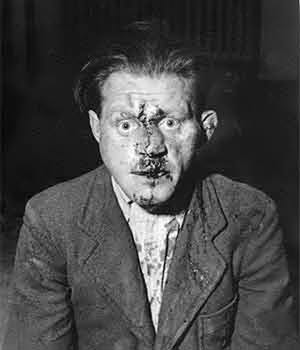
When discussing what “makes” a great portrait with Exposure Compensation’s Miguel Garcia-Guzman, we quickly realized that we couldn’t really agree on much. So we figured we might as well ask some other people, and we sent out an email to a large number of photographers, fine art and commercial, bloggers, curators, editors, and gallerists: “What makes a good portrait? Could you provide us an example of a portrait that you really like - either from your or someone else’s work - and say why the portrait works so well for you?” to publish what we would get back on our blogs, as a collaborative effort to get a little bit closer to understanding the topic. Below is what we got back from those who managed to find the time to write something. Our thanks to everybody who contributed!
Timothy Archibald: Trying to really pinpoint what makes a great portrait is almost like trying to figure out why it feels good when someone smiles at you or why it is disturbing when someone yells at you. There are these rules, this structure, and then there is this human intangible element that is the wild card. Everyone seems to know how to play by the rules and follow the structure, but as far as the intangible goes, this third element, that’s where it all falls apart or comes together, it allows the portrait to sink or swim or really transcend.
How to describe this intangible third element? I really can’t, but like a lot of things, you know it when you see it. Arbus’ work has it for sure. When trying to come up with someone contemporary who exhibits this quality, I kept coming back to the work of Judith Joy Ross. Looking at her work, there is no filter, the viewer isn’t really aware of all the mechanical decisions that the photographer is making, it is simply a direct transference if emotion and information, going directly from the subject to the brain of the viewer. The photographer somehow was simply a conduit for this information to travel through.
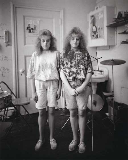
The Stewart Sisters, 7th Grade [see above] demonstrates this intangible. The girls are being photographed, communicating with the viewer, being self aware and being all of these things and more, nothing is very dramatic, nothing heavy handed, but the end result feels utterly profound. The result seems to be a picture of these girls, but then seems to be communicating something universal as well.
Timothy Briner: This is hard. Because I do have specific ideas of what a good portrait may consist of, but I am often amazed at the portraits I come across that do not abide by any of these “rules.” Many of these images are truly spectacular. And it further reminds me that good art is made up of many things, and this question can almost never really be answered, at least not with any certainty.
I believe many things go into the creation of a good image. But sometimes, nothing at all, except luck and patience.
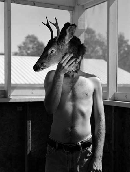
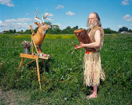
Nathan, Boonville, North Carolina, 2007: This image is made up of many of the elements in which I strive to make all my portraits. It has meaning, it is graphic, it is telling, and has strong lines and light.
I first met Nathan at a diner and he invited me back to his place. While taking a few portraits, Nathan asked me if I wanted to see a deer head that had been in his freezer for over a year. This was the luck part. We spent a few hours taking pictures with it, and when I went home, I started to analyze the image in my head, and even had a graphic dream of it that night. I returned the next day, took more shots in the same spot, and again, I went home, analyzed the image, and realized that it still wasn’t perfect. The image I had taken on the second day evoked touches of irony, and that was not my intention. On the third day I created this image. I wanted to tell the story of both the lives of this young man, and the deer; Their connection to each other, and to nature.
The lines and light, and meaning of this image mean a lot to me. The meaning may only be known to me, and may only be beneficial to me, but If a portrait can create a strong and moving story during a viewing, and furthers itself with great use of light, lines, and framing, then that to me is almost always a great image. Of course there are exceptions to every rule. But I am very happy with this image, and believe that the story is in the image. But it is mine, and I am strongly connected to it, so I am surely biased.
Thomas Broening: I think for a portrait to be great it needs to say more about that maker of the image than the subject.
Avedon said that all portraits were accurate and none of them were the truth. They are all in a sense a postulation or an argument. Every-time a photographer points the camera a another person he is making a judgement. The grander the judgement the greater the lie.
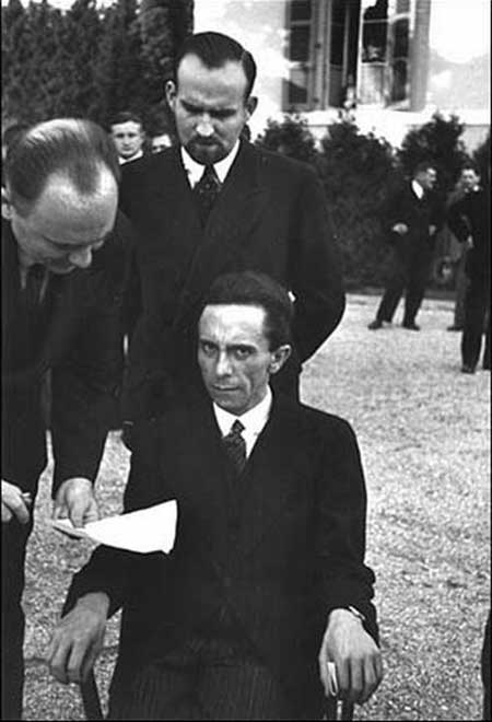
Look at Eisenstaedt’s menacing portrait of Goebbels or Kelly Krabill’s portraits of the girls at her neighborhood church. Eisenstaedt made the picture because he had something he wanted to say about Goebbels. The image is more of an indictment than a likeness. In Krabill’s case she is exploring her own anger through images of the young women from her church. In both cases the photographers make strong imagery because they were both willing to take stand and make a statement about their subjects and themselves.
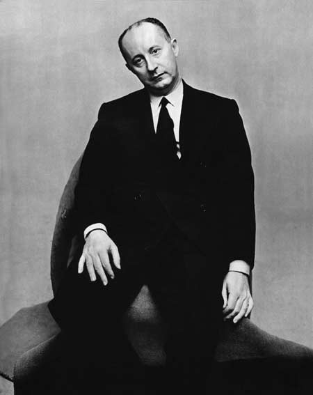
Chris Buck: A great portrait can have beautiful lighting, a curious location and a pleasing composition, but it’s a sense of vulnerability that really makes a picture exciting for me. Vulnerability and awkwardness are access points for the viewer, and a suggestion of real humanity.
David Burnett: A great portrait? So many possibilities. In painting, I’m drawn to the Flemish of the 16th and 17th century. The great painter Bartholomeus van der Helst’s enormous canvas “The Militia of Amsterdam in Celebration of the Peace of Munster, 1648”, we see nearly two dozen burghers, each perfectly arranged, perfectly lit, placed in a way that let’s you understand immediately who is in charge. Someday I would love to be able to mimic the look. the lighting, the posture of this painting. It is truly a masterwork, and when I think of portraits, it hits me right between the eyes.
Translating such a look to photography is much more tenuous (not to say that it was ‘easy’ for Van der Helst). Of course we can control our subjects, lighting, situation, though perhaps not with the ease that a painter can leave out or add some element. In the end, what strikes us is the feel we have for the subject, and not, strictly speaking, how the photographer ‘shot’ it. There is a full visual combination - texture, light, expression, the eyes and regard of the subject - those are the pieces that attack our senses as a viewer. Do I feel something inside - a reaction which I cannot express? Do I sense a moment of tension, humor, a subtle knowing flutter when I connect with the eyes of the subject. Does he, does she speak to me? Do I want to know more about them? That is, in the end, the point: take me to that person, that group, and make me want to know more, more, more about them.
Doug Dubois: About a month ago in a hotel room in New York, my father looked at my book of photographs about our family. It’s a small volume of taped color laser prints, mostly portraits of my mother, brother, sister and him made over a period of twenty years. He’s seen many before, but not sequenced, edited and carefully placed on a page. It’s his chance to see everything before it goes to press. I watch him turn the pages.
The book begins with my father packing a suitcase in a hotel room twenty years ago. I am almost as old as he was then, and can’t help making comparisons. If I didn’t shave my head, our hairlines would be pretty much the same and I recognize the pattern of creases on our necks. He wears a white t-shirt with a handkerchief neatly folded and tucked with the corner sticking out of his back pocket. This affectation marks a difference between us. His t-shirt will disappear under a button down shirt, and a suit jacket will meet up with the pants while my t-shirt hangs out over jeans, the usual uniform of my age and aspiration.
He remembers the trip fondly and lingers on this opening image. He notices perhaps, how the morning light reflects off his suitcase to make three dots of an ellipse on the wall and again, although he’s really not that observant, how the water spots on his t-shirt do the same. Most likely he simply sees his younger self: a man packing his suitcase, in a hotel somewhere between home and work.
…
Several of the photographs were carefully framed by my father and displayed in my parents’ home before their divorce. I often wondered how they negotiated their division. He kept the photograph of my sister turning at the mirror and the image of him at the train station. My mother kept only the photograph of my brother at Christmas. Rescued from the trash is a print of my parents in a bar in London. It hangs in my brother’s apartment in New York.
My father pauses at this photograph - she looks happy, he says. The alcohol from the drink in her right hand mixed with the reflected light from the table provides a glow to my mother’s face and a gleam in her eye. My father leans towards her in conversation. My mother stares down at the table but offers a slight, flirtatious smile. The frisson between them is plainly visible. My father remembers this with a measure of fondness. My brother, who sees the photograph every day, must share his nostalgia. But for my mother the image is best left behind.
…
My mother lies on a bed in a hotel room. With one hand oddly poised on her head and the other gently holding her elbow up at a right angle, she stares at the far wall. This photograph is new to my father. He sits looking at the image on the desk by the bed not realizing that it was taken in the very same hotel on a bed identical to the one he has just slept in. I point this out and watch his eyes move from the window, the curtains, the bedding and back to the photograph. These banal details animate the room with an uncanny presence - as if my mother was just there.
My parents have not seen each other since their divorce more than five years ago. It’s been long enough that the changes rendered in the photographs are apparent and surprising to each. These images serve, in a sense, as their only contact. Despite their close proximity within the book, the photographs of my parents offer no solace or reconciliation. At best the portraits mark the growing gap between their former experience together and the nascent conditions of their respective lives. What occupies this space is opaque to my camera and too intimate for me to trespass.

Joakim Eskildsen: A good portrait for me is something that gives an insight into the portrayed inner universe, reflected via the surroundings and the mood of the light and the person’s mental state. It must somehow also have a secret that you want to take part in or that makes you wonder. Also, it is great if it puts your own feelings into this universe by looking at it, and reminds you of this feeling.
This picture is of István in Hungary. The color and the light and the cracked walls, and the mood of István make me interested, and I am able to recall the feeling of the moment by looking at it.
Rob Haggart: A great portrait is surprising and insightful for the viewer.
The insight comes from learning additional information about the subject beyond what they look like. It can be subtle (expression, body position, bits of context) or it can be dramatic but it should never be obvious.
The surprising part can come from making an unlikely context to subject pairing or creating an unexpected situation for the subject to react to.
I really like Chris Buck in this regard.
Here’s one of my all time favorites from Chris.
Bruce Haley: These days we have cold, detached color portraiture oozing out of photography’s very pores… it is almost inescapable… while I quite like the landscape and architectural work being done in this manner, the portraiture leaves me, well, cold and detached… I find myself flipping through this stuff almost as if I were going through the telephone book…
Call me a dinosaur or whatever, but for the most part I like portraits to be engaging, not chilly - and sympathetic, rather than demeaning or cruel… I would much prefer looking at Dorothea Lange’s Migrant Mother for the umpteenth time, as opposed to the latest garishly-lit and insulting photographs of everyday folks on holiday at the seaside (after all, most of us can be made to look crass and stupid if photographed during public rituals like shopping or vacationing)… So to make a sweeping generalization - and place a subject with infinite gradations into the simplest of nutshells - I would say that my preference is for portraiture that imparts dignity as opposed to stripping it away (yet on the other hand, who can deny the power, and the worth, of Avedon’s portraits of his dying father, or Arnold Newman’s sinister portrait of Alfried Krupp?).
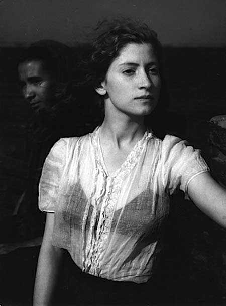
One of my favorite examples of portraiture would have to be Edouard Boubat’s stunning Lella, Bretagne, 1947… here we are presented with a real person, one who has been captured in two dimensions yet leaps off of the paper and right into our world, a living, breathing woman… she is both unique and intimate (we know this woman), yet at the same time she is iconic and archetypal and timeless… she is strong, she is determined, she is a modern-day Jeanne d’Arc heading into battle - and yet she is vulnerable, emotional… she is a Pre-Raphaelite beauty, and it is achingly apparent that she is to Boubat as Jane Morris was to Rossetti…
And what do we glean from the small amount of information concerning her surroundings? I see her on a boat, or a ferry, and I can hear the waves lapping against the hull and smell the water and feel the wind that is blowing through her hair… and I can taste the salt on her skin….
And I can ask no more from any portrait……
Bill Hunt: In his essay for “Close Encounters, Irving Penn, Portraits of Artists and Writers” currently on view at The Morgan Library & Museum, curator Peter Barberie writes, “If the fundamental task of portraits is to capture subjects differently than they present themselves to the world, Penn has succeeded admirably. He enters into hard negotiation with every personality that stops in front of his camera. Very often he wins.” This seems like a reasonable spot to begin a conversation about portraiture.
My own take on this genre, after many years of looking at and collecting photographs, most always images of people, is that portraiture by and large fails to connect the viewer and the sitter in any sort of revelatory and meaningful way. I have collected many hundreds of images of people in which the eyes are obscured. They can be closed or veiled or hidden. The photograph must also have a magical impact on me.
With the collection, I have always been fascinated by what happens when the photographer does not attempt to capture some poor soul, literally through their eyes, but by denying that or by offering parts, not the whole. I am engaged when information is withheld. When the artist insists that I collaborate on the meaning or significance or power of a photograph, when I am brought into the work, it behaves much more powerfully.

The first work in my collection, Imogen Cunningham’s “The Dream”, 1910, has a marvelous Sphinx-like quality. I don’t know that any real information is revealed, but I do know that she captivates me consistently.
Some of the better-respected portraitists like Stieglitz for instance underline this phenomenon. The O’Keefe nudes with a detail of hands or breasts are incredibly timeless and evocative as opposed to the “straight” portraits.
In the large MoMA retrospective a number of years ago, I remember the blazing eye whites that Stieglitz achieved in the darkroom using potassium ferrocyanide. This is an old photographer’s “tool” used to open the eye highlight to grab our attention, wanting to create that Mona Lisa-like eye contact that follows you around the room. There also seems to be evidence of this in the Penn exhibition. But then compare the power of the Jasper Johns portrait with that of Ingmar Bergman. I think the Bergman wins.
There is another element in portraiture that I think is worth commenting on which is evident in the Penn show, the notion of caricature. Penn’s “corner portraits” work in quick strokes, much like sketches. The enormous and merited success of Annie Leibovitz’s earlier celebrity work behaves like this too. Her iconic Whoopi Goldberg, bathing in milk, and Meryl Streep peeling off her mask/face are brilliant short takes.
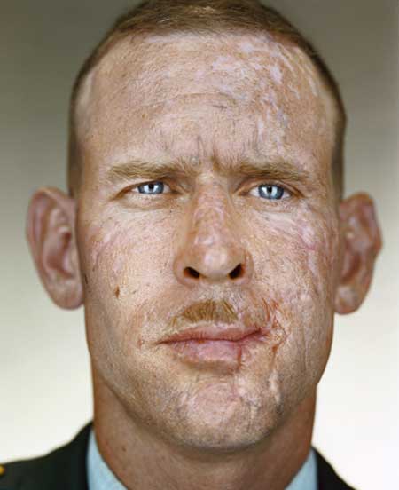
As a gallerist with HASTED HUNT, I am the first one to acknowledge the irony of our current exhibition of Martin Schoeller’s “Recent Work”, additions to his ongoing portfolio of “Close Up” portraits. The typological consistency achieved through the artist’s rigorous tight framing and lighting is astonishing. The genius comes in his ability to elicit real life in these sitters. He seems to connect with them, and this shows up in the images. Of all this work though I am most drawn to his portrait of Joseph Mosner, an Iraq war veteran whose ravaged face presents a complex, hard and unknown history. With the celebrity work, you bring a great deal of familiarity to the subject. Schoeller’s technique has the potential to offer a fresh take.
My overall take on portraiture is its overwhelming failure to transcend its basic information gathering, to offer more than the most superficial report, the well lit ID photo. How rare and surprising to find the powerful and transcendent.
Kalpesh Lathigra: When I first starting taking photographs for The Independent Newspaper in London, I subconsciously was shooting the “house style”…… it was only when I stopped and made a decision to move to magazines and long term projects that I began to immerse myself in looking and exploring authorship of the photographer. For me it is a matter of “what were they thinking”… the moment the shutter is clicked, both of the subject and the photographer…… I want to try to capture at least a moment where my subject transcends the expectation of being photographed and moves from posing to a state of grace, obviously I am not naive enough to think that the subject is not directly interacting with the photographer, but what I say to my subjects “is to focus and concentrate on the most important thing in their life, whether it is a moment of happiness, sadness or indifference to the wider world, just a very personal moment, from there the interpretation of capturing that is down to me.
I would say that the portrait that resonates with me is Nadav Kander’s David Lynch for the New York Times, there is a stillness and detachment but still emotion and a question, whether Lynch has been styled or not I don’t know but hair and the simple shirt collar sticking out make all the difference to the photograph, almost an ordinariness to the man yet there is emotional strength in moment. If you look at Kander’s portrait of Armani, the same applies yet it is a complete different style but the link is the authorship, detachment yet emotion.
Olivier Laude: I’ll have to admit that I am not a big fan of portraits as a whole. They are over valued as works of art or as general gallery and magazine fodder. Portraits usually feel staged and temporal, because they are, by their nature meant to be illustrative and propagandistic. The myth that the portrait, the good ones, the bad ones and everything in between, are an important and enlightening window into the soul of the sitter is just as much of an insipid cliché as the soul itself.
In a vacuum, what makes a portrait interesting and successful is the subjectivity of the photographer towards his or her subject. The idea that a great portrait can, and should capture the essence of a human being, is as absurd and deifying as to ascribe god like qualities to any human being, photographer or subject alike.
Portraits for the most part describe an edited moment within a window of personal and theatrical opportunity. Nevertheless, there is a style of portraiture which comes close to achieving the portrait’s mythological goals and that would be the vernacular portrait. Those images taken without pretensions and with minimal expectations on the photographer’s and the subject’s part. These kinds of images are very rare and only seen when you see them.
Like the old adage about pornography, which is that you know that it is, when you see it, the portrait works in much the same way, you see a great portrait when you see it, and then again that is as broad a description as the myth of the portrait itself. The great portrait is only as good as the last pair of eyes which gazed upon it, and where ever that may be.
There is an old trick in photography which dictates that in order to please the sitter with a portrait they will find pleasing or personally revealing, you should flip the image horizontally to mimic the image of themselves they would normally see as if gazing in their bathroom mirror. That trick says much about the portrait itself, as an artifice of photography, it manipulates reality to please, judge or deify the subject in order to aggrandize, demean or mythologize ourselves. To my mind, the portrait lacks depth for those very reasons and for these very real and incapacitating barriers.
As for myself, there is a great quote by Fellini which states: “Don’t tell me what I am doing, I don’t want to know”. Consequently, don’t ask me what I am doing, I don’t want to know. But it just so happens that everyone wants to know, present company excluded. Me don’t need to know. Experience trumps reason. I like standing on a summer day in the San Joaquin valley and feeling the sun’s rays; the way I loved light when I was six years old but did not need to think, or convince others, to think about it or profit from it. Nevertheless, I am often accused of being a portrait photographer. A bit like accusing your reflection of being a mirror. My people may be staring at the camera but they are not portraits. They are not staring at you; I am.
Jason Lazarus: I have three answers that stem from my occasional impatience for the ambiguity found in portraiture.
1) A good portrait can be made through expanding your commitment to your subject. In this way, I’d say that Mitch Epstein’s project/book ‘Family Business’ is a great portrait of his father. It has an ambitious scope, as the book is a portrait divided into 4 significantly sized sections: store, property, town, and home… and even features video stills interspersed with more traditional large format beautiful color images.
2) A good portrait can be made through the use of text to further complicate and expand an image, as in Jim Goldberg’s ‘Rich and Poor’ project, where the dam breaks as people scrawl their most intimate thoughts, fears, and musings onto the negative space of environmental portraits of themselves.

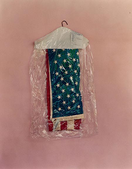
3) The removal of the subject, well illustrated by Christian Patterson’s picture ‘Ernestine’s Portraits’… Christian does not make portraits, but this picture i consider a great portrait! Circumventing the conventions of portraiture, for me, often creates compelling possibilities
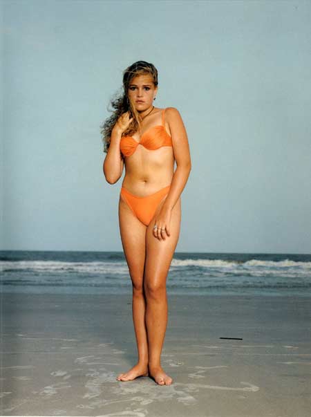
Colin Pantall: In Rineke Dijkstra’s Hilton Head Island, South Carolina, USA June 24 1992, a girl in an apricot bikini stands awkwardly on a South Carolina Beach against a drab grey background of beach, sea and sky.
The foreground is lit. The young woman stands on her little patch of sand. Dijkstra photographs the girl with sympathy, but despite this sympathetic portrayal, the girl looks isolated and lonely.
Her isolation is accentuated by her appearance - she’s made herself up (this picture is an appointment picture, and thinking it would be some kind of a model shoot, the girl wears layers of make up). She also sucks her stomach in - because her mother is on the sidelines telling her she looks fat. And perhaps because of this, she has a look of anxiety on her face, an expression that is almost confused.
So the girl in the apricot bikini is uncertain of where she is and who she is. She exists in a Anglo-adolescent zone of darkness. The background landscape is a series of stratas of greyness, from the beach to the sea and, punctuated only by the turbulence of rolling waves, a sky of overwhelming greyness, and that seems to be where her future lies.
In terms of technique and lighting, it is not an especially complex picture. In terms of what it shows, it is. Dijkstra uses landscape, light, body, dress and facial expression in a way that reveals something about the girl that goes beyond the photographer. She leaves the image open to interpretation and uses factors outside her control in making the portrait - the finished article is a product of circumstance and chance, and not Dijkstra’s machinations. The picture has social, psychological, sexual and cultural layers to it, it has an emotional narrative and it ties in with a photographic tradition. Everything in the picture matters. It’s an image that has stood the test of time, from a series that has stood the test of time. And though it is a famous image, and many people have attempted to copy it, nobody has come close. It’s still original and it still packs a punch.
Amy Stein: “Make” implies that there are ingredients; that there is a recipe for a great portrait. I believe great portraits happen, but they only become great portraits after the photographer has parted ways with the subject, printed their contact sheets and found (hopefully) a diamond among many dogs.
The qualities that would make that single image stand out to the photographer are the same qualities that would hopefully translate to the viewer. The primary quality being the obvious and clichéd quality that makes all good art good; there is a tension in the moment. The tension could be there for any number of reasons: the photographer’s attempt to unsettle the subject with words or actions, the subjects desire to control the situation, a mutual trust that produces a raw and honest exchange, a chilly day, the cold water of a stream, etc. I believe there’s no recipe, no replicable means to these moments. They happen and it’s wonderful.
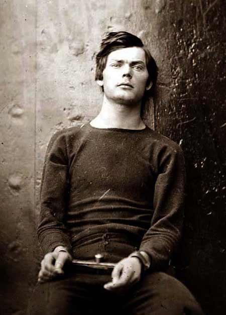
The attached image is of Lewis Powell who was a co-conspirator in the plot to kill the leadership of the United States during the Civil War. On the night that Booth shot Lincoln, Powell attempted to kill William H. Seward but failed. The photo shows him in manacles after being apprehended and prior to his execution.
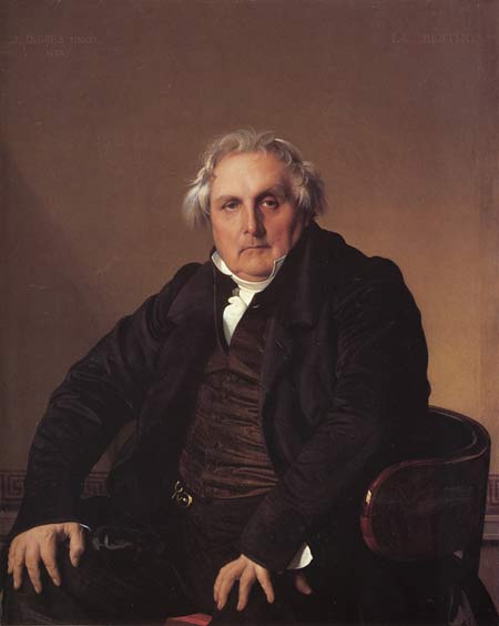
Bill Sullivan: I relish this opportunity to profess my undying love for one portrait - Jean Auguste Dominique Ingres’ portrait of Louis-François Bertin: no other picture that I have ever seen is to me so much like physical thing. It has presence.
The framing is really counter-intuitive, there is a great deal of space between the top of the head and the top of the canvas which is the opposite of how you would frame it if you wanted the subject to appear to come forward. It gets its strength, and takes form like a real 3d object would from its base - using those claw-like hands to hold up the massive body.
But if the question is “what makes it a good portrait?”, I would have to say because “I believe in it” and I love its form. I think with Ingres portrait its believability though is crucial to its presence. It looks like a real guy who just happens to be a newspaper editor, who just happens to be sitting there, who just happens to be looking at you and who just happens to look like Zeus. It all just works. I believe it. I give myself over to it and suspend my disbelief just like I would with any good movie.
So believability becomes crucial, “do I want to believe in the picture?” It is the difference between Wall and Crewdson, they are both equally fake, but Wall is more believable so I give myself over to the reality of his picture in a way I can’t with Crewdson’s.
And the other element is form, it there something about the form that I like. And usually I like it because it crates a physical presence like Ingres portrait of Bertin. I had taken a photograph for an earlier series of work using a hidden camera that I was carrying around. It is an image of a woman sitting in front of a fountain looking straight ahead. It is one my own favorite portraits precisely because it has that Ingres sense of form or volume.
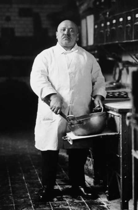
The other artist that I think often combined that sense of believability with a great understanding of form was August Sander. I am often struck by the Ingres-like nature of so many of works. His image of a pastry cook from 1928 , like most of his work, has that great balance between shape and reality. So ultimately I guess it would be the ability to create presence through the combination of form and believability.
Tribble & Mancenido: We cannot say we are not biased to such a question, as it is one we ask ourselves each time someone is in front of our cameras. A good portrait allows the viewer to momentarily step outside his or her own reality giving a glimpse of another. It is an emotional exchange between subject to photographer and ultimately to viewer, momentarily caught somewhere in between, experiencing a moment of visual sensory and curiosity from an immediate feeling of invitation.
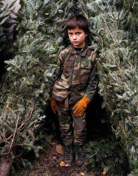
As portrait photographers we find it only fair to use one of our own images as an example - Timmy, Jane Street Park, NY. We are always drawn to this image for we feel it invites the viewer to continue the visual dialogue started. Alluding to innocence lost, the man within the boy, and a confident youthful stoic gaze, his eloquent pose, gesture, boots, camouflage and gloves elicit questions to further discourse. Those same curiosities provoked us to photograph him again a year later.
Brian Ulrich: I’ve come to the conclusion that photographic portraits are some of the hardest photographs to make.
In many respects the photographer is the lead in a crazed power dynamic; the sitter must lend themselves, their time, patience and likeness to the photographer in a relationship that has to have some degree of trust in how the photographer might represent them. The photographer, in some cases knowing more or less about the subject, has a opportunity to describe them in a number of ways. All this often leads to the eternal portrait question: From the sitter, “What do you want me to do?”.
It’s utterly fantastic to think of the psychological implications of all these goings on in some cases in a 2 minute meeting, in others a 1/2 a second. Certainly there is nothing normal in this act. Which might explain most people’s reactions to photography, “You want to take a picture of me….?”
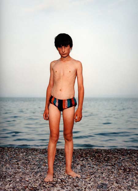
To pick one portrait photograph that stands out to me is tough. So many make the process seem effortless (even if I know better). Dawoud, August, Diane, Alec, Katy, Chan, Lisette, Julia, Hawes (and that other dude Southworth), William, and oh my god.. Walker, among others seem to really understand how portraits are a ever changing recipe based on the ingredients, description and fiction. One though that never-ceases-to-amaze-me-since-the-first-time-I-saw-her-work is Rineke Dijksktra. Rineke seems quiet. She has no blog, no website. I don’t hear of her partying escapades at various international art events. I do see her pictures, a lot and there is always new.
A few years ago Bill Sullivan (another great portraiter) and I spent the day wandering through the Armory Art Fair. We wanted to see everything, especially photography. It became a bit of hunt and at the end of the we both came to the conclusion that Rineke is one of the few artists who really understands portrait photography. Her pictures deal in optics, fidelity and science so well, I am transfixed by this illusion of a person standing in front of me. The emotion kicks in and I’m done….

Peter van Agtmael: For me, portraits are pleasing as single images, but are best in the rare series that reveals a small piece in the puzzle of our existence. I’ve learned the most from David Goldblatt’s fifty years of work in his native South Africa. In straightforward images of ordinary people in their surroundings, he portrays the infinitely complex and contentious intersection of race, religion, wealth, politics, and history that define every human society. Although much of his work illuminates the divisions of Apartheid-era South Africa, the pictures aren’t relegated to a time and place. Instead, they force us to question the very nature of good and evil, while confirming that the qualities that make us human are enduring and universal. Photography’s sad seduction too often highlights the surface divisions amongst us. Goldblatt avoids useless cynicism and comes closest to discovering the elusive notion of truth.
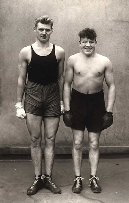
Dylan Vitone: What generally makes a good portrait for me is the subjects gaze in the image. Whether they are looking outwardly at the photographer or turning inward in thought if the person has expression on their face that I can empathize or connect with the emotional state I get sucked in. It does not have to be a overly emotional or intellectual state. August Sander’s picture of two boxers is one of my favorites. One boxer serious and the other with a wide grin….. Like he just did something wrong. I always wondered what these two talked about. The serious one tall and skinny and the overly happy one short and stocky seem to have little in common. Each energizer their half of the photograph in completely different ways like their worlds never interacted. It was not until after several viewing that I notice the tall one looked like he had had his shoelaces tied together. Maybe they did interact more than I thought.