What makes a great photo?
A little while ago, someone sent me an email and asked me whether I could tell him what made a photo great. I wrote back that I had been thinking about it (so far, so good) and that I was in the process of writing an entry about it (well…). In principle, it’s probably the easiest question to ask. We know a great photo when we see one. But then describing what it is that makes it great is an entirely different matter. And, of course, different people pick different photos. So I thought it would be quite silly if I wrote an entry about this all on my own and pretended I was some kind of authority. Instead, I emailed as many friends, fellow bloggers, and photographers as possible - looking through my ‘contacts’ - and asked them instead, the idea being that, in the end, it is probably the sum of what every single person has to say that will answer the question “What makes a photo great?” - or maybe not (which would make it all the more interesting). Find behind the fold what people wrote back. I am most grateful for each and every answer I got, and I hope you’ll get as much of a kick out of this as I did.
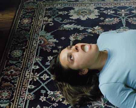
Timothy Archibald: “This photograph, by Ahndraya Parlato, has been infinitely fascinating to me over the past two months. I look at it, think I got my fill of it, and look at it again a few days later and it still strikes me in new ways. Here we have a non-descript, average dressed woman, lying on a patterned rug, with something that looks like milk filling her mouth. I don’t know what the photograph is about, I don’t know what it is saying, but with these minimal elements Parlato has created her own vocabulary. The photo speaks with this vocabulary; I think I get what its telling me, but it just doesn’t translate to words. When a photograph takes risks, reaches far out into the land of what is almost unacceptable or goofy, but then somehow really delivers the goods, I tend to refer to it as ‘great’.”
Tim Atherton: “My great photo : Parc de Sceaux, mars, 7 h. matin 1925 by Eugene Atget.
“What makes it great for me?
“The first time I saw it (in reproduction) I caught my breath and something kicked my gut inside. At the time I was still trying to figure out what all the fuss was about Atget - this was one of the clinchers (probably the main one).
“It’s so in-your-face and yet exquisite at the same time. It’s stark - almost harsh, but still beautiful. It’s hard to think of another photograph from the period where the photographer so ruthlessly (and powerfully) divides up the picture. If I could buy one photograph this would be it.
“Certainly, over time, as I learned more about Atget, I put the picture more into it’s context - This was getting towards the end of his life, this was just done for himself - there is little chance and artists of the sort he sold photos to was going to buy this, nor does it really seem the sort of picture the Paris library’s would buy as representative of the parks - it has a very personal feel to it. It’s also not that long after the Great War - which had a major effect on Atget - it could almost echo the blasted trees of the Somme.
“But all that extra information merely confirmed my initial feeling and reaction to it, adding some meat and depth to it.”
Jeff Brouws: “I follow Garry Winogrand’s thinking: a good photograph has a balance between aesthetics and information.”
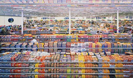
Jörg Colberg: “When thinking of a great photo, a whole lot of them come up in my mind, with the most immediate ones 99 Cents by Andreas Gursky (see below), and one of Sally Mann’s portraits of one of her daughters.
“99 Cents might be me all-time favourite photograph. For me, it is the essence of what contemporary colour photography is all about. It’s an explosion of colour and detail, which is immensely disorienting, and it is strict and formal, despite its depiction of utter (controlled) chaos. You can look at the photo for hours and still discover something new. And it manages to show us something utterly mundane and transform it into high art.
“Sally Mann’s portrait is just great. I don’t know whether it’s posed or not, but I don’t care. Unlike so many of the goofy, digitally overprocessed and ultimately entirely unimaginative portraits that are so popular now, many of them nothing more than photographic equivalents of Thomas Kinkade paintings, this photo just shows the very intimate and caring relationship between photographer and subject. A great portrait lives from what’s underneath the surface.”
Todd Deutsch: “I find it difficult to separate a photograph from its siblings, or more to the point, from the photographer who made it. Trying to understand what makes a single photograph work seems something like an exercise in identifying good grammar. It is useful to a degree, but too much like diagramming sentences. All of the pieces can be in the right place to attract my attention (I am a sucker for well organized chaos), but in the end it is an entire project, or the photographer’s sensibility over time that makes a good photograph into something capital ‘G’ Great. Lately I have been drawn to groups of pictures made by Mitch Epstein (Recreation, and Family Business, mainly). The world as Epstein presents it is complicated, dense, and in a perpetual state of quiet, inevitable change. It is also beautiful and, at times, tragically funny. What makes his work capital ‘G’ Great is that Epstein has nailed the grammar of observation necessary to tell us about it.”

Amy Elkins: “It’s hard for me to describe what makes a great photo mostly because it’s hard to predict what you might like before you see it. I’m often surprised by things that I’ve never thought I would enjoy or seek out in the world . My bias weighs heavily on the portrait side of subjects that make good and/or interesting photographs. I’ve recently stumbled across Israeli photographer, Michal Chelbin, and have been really excited about her ability to make strong documentary portraits. All of her subjects are giving an amazing amount of themselves to her, which speaks about the way that she approaches and interacts with her subjects while photographing them. This to me is one of the most important aspects of being a photographer: knowing how to use the space between you and your subject, understanding the dynamic you are creating by showing up at that particular moment with your camera and being patient until the moment is there (for me this moment is marked with a sudden flutter in the chest and usually a noise of excitement such as direction not to move a muscle).”
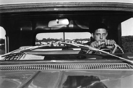
Jonathan Gitelson: “This photograph by Lee Friedlander has long been one of my favorites because of its cinematic quality. If this were a scene from a movie, it would either be the moment right before or right after a major twist in the plot. The props tell more of the story: we have a pair of sunglasses on the dash in front of the steering wheel and an mobil travel-map. Is he on a roadtrip? driving off into the sunset? is he lost (literally or spiritually)? There’s a sense of anticipation, reflection and numbness.
“I also love the staged element of the photograph and that we are allowed in to see how it was made. A basic dissection of the scene: we have Lee parking his car on a hill. He gets out, puts his camera on the hood (see reflection in the foreground), sets the self timer (?), gets back in the car and stares as blankly as possible into the distance and clutches the steering wheel: A one-man performance.
“And finally, as with so many of Lee Friedlander’s pictures, I’m left with question: Is the whole thing just a joke?”
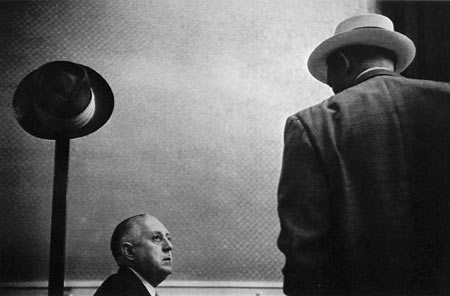
William Greiner: “There is always something mysterious about a great photograph. On an intuitive level it can be quite obvious, but to articulate ‘why’, can be very difficult! The sum of a great picture adds up to more than just it’s parts.
Tobias Hegele: “Choosing one single photograph to explain what makes a photograph good is a difficult task. Paging through books I swayed from Schink’s cool Verkehrsprojekte, to the portraits of Avedon, Fischer and Dijkstra, past the overwhelming choice from Meyerowitz’ ‘American Prospects’ and ended up with an unlikely candidate considering my present taste in photography : André Kertész’ beautiful and touching image of a glass bust in his window.
“On its own, it is an elegant and beautiful black and white still-life but the background to photograph ads a very emotional element.
“Kertész came across the glass bust in the window of a shop and the bust’s elegant posture reminded him of his late wife.
“He took the glass bust home and made a series of photographs. The city outside reflects in the head of the bust and each image has a different face and atmosphere to it.
“There is nothing cool or wow about this photograph and it would struggle up on a wall next to a blow-away Schink but it reaches out to me like no other photograph has done before : an elegant, intimate and personal portrait of love and loss.
“So as per that definition, what makes this a good photograph goes beyond form to the purely subjective relationship between me as the viewer and the photograph itself - but I think what your little project will show that for every photograph there, there will be another reason why it is good for that respective viewer - my reasons for believing photographs from say Schink, Avedon or Meyerowitz are good photographs are totally different …”
Chris Jordan: “To me a great photograph is one that works on several different levels, offering something new again and again, like a good piece of music. Visually it has a particular kind of intricacy or vividness, or an extraordinarily complex and beautiful tonal scale. Intellectually and emotionally it conveys an unexpectedly rich perspective that expands my consciousness one way or another; a viewpoint that moves me every time I see the image, even after many viewings.”
Hester Keijser wrote something about the topic on Mrs. Deane.
Len Kowitz: “I’ve sent you what I hope is a link to the Getty and a video of Walker Evans talking about his photographs.
“As he says the qualities that make for an interesting picture are fairly simple, it must be evocative, mysterious and at the same time realistic.
“I believe that to be true.
“In another comment Evans said, ‘Leaving aside the mysteries and inequities of human talent, brains, taste and reputations, the matter of art in photography may come down to this, it is the defining of observation full and felt.’
“There’s nothing more that I can add except to say that great photographs are extremely rare.”
Anthony LaSala: “There are so many, but the past few years I have been in love with this photo by Abelardo Morell. It’s titled ‘Laura and Brady in the Shadow of Our House, 1994.’
“What makes this and other images great photos? I think, quite simply, it’s the images that stay with you long after you first encounter them. Whether they have complexity, a visual intensity, or the power to convey certain emotions. Here, in one frame, Morell captures perfectly the enchantment and imagination of childhood, the charm of family, the splendor of being languorous and the feeling of security offered up by the looming presence of a home. This photo has remained in my mind since I first witnessed it and it never fails to make me smile.”
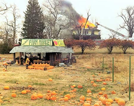
Jason Lazarus: This “Sternfeld image at once fails to show the quiet pleasure of a photographer always looking, yet reveals the fruit of stumbling upon a moment so iconic it will outlive its creator by generations.”
James Luckett: This “statement is tangentially related to two different prints by Edmund Teske”, one to be seen here
“Sifting the question - what makes a great photograph - and it keeps reducing down, sorting fine, intangible. A feeling of giving away too much.
“There is my father the ghost - relaxed back in a chair, eyes lowered, staring into the lens and a glass raised - as if he’d returned or maybe just never left. and it dawns on me I’m already older.
“Another of my mother, before i was born - a smiling young woman drinking beer outside, a warm summer afternoon in Stuttgart - a life imagined once different. Value in photographs lie with use.
“Or living Tokyo, I met someone close - when then I thought, as I know now, I’d never see her again, and I wanted a photograph - she turned and glared into me like I’d hit her : just a thing, have no meaning.”
Matt Niebuhr: “For me - a great photograph
“What makes a photo great?
“This is a tougher question to answer of course, but here is my attempt:
“Specifically, the example photograph reveals (through extremely long term exposure) an accumulation of moments that in total are more like a memory. The technique Wesely applies in long exposures (see also his portrait series) goes beyond the immediate visual detail. There is a kind of discord / dichotomy that I like about them. I like the passage of time collapsed into a ‘still’ - and the instant extended - the photograph reveals something that ordinarily is only held in memory. The photographs are wonderful attempts at making pictures of ‘time’ and ‘memory’.
“Generally, I feel that a great photograph needs to have the capacity to provoke the viewer to wander beyond the immediate image - towards something beyond what is ordinarily visible. Photographs that reveal something about the perception (whether or not I have a similar perception) of the subject are more interesting to me than photos that merely record the subject.
“I like to try to hear with my eyes what the photographer is saying.”
Christian Patterson: “I think it’s difficult to pinpoint what makes a photograph great. There is so much of the viewer’s personal experience wrapped up in that greatness.
“I can’t help but think of musical analogies, so I will turn to the shelf and pull out a classic 45, and give it a spin.
“I will say that I love this Lee Friedlander photograph. It’s a beautiful example of photographic vision, composition and personal perspective.
“Friedlander created this image like a skilled jazz musician, playing within the landscape (a key), arranging its objects (like notes in a scale), striking a visual chord (the left tree, yield sign and right tree forming that chord; the smaller houses and cars like harmonic overtones).
“There’s also a very strong sense of first-person perspective in this image, and much of Friedlander’s other work. It pulls you in; you feel a part of the photograph. Just like a great song, it stays part of the artist, and it becomes part of you. You’re really there.”
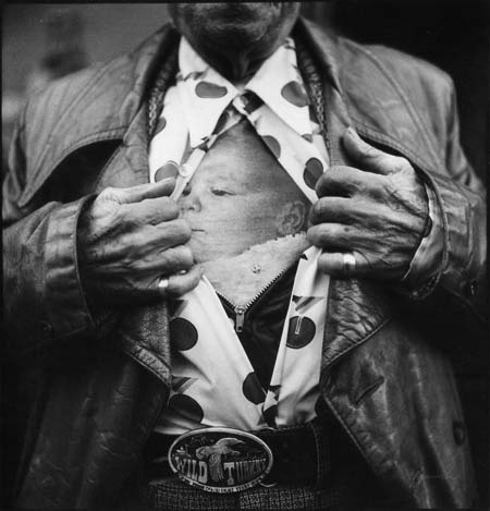
Paul Shambroom: “I bought this print about 25 years ago from the artist, a friend of a friend in NY. Her name is Liz De Mayo, I have no idea where she is or if she’s still making photographs. (in the unlikely event she sees this, hope she doesn’t mind that I submitted it!) I never get tired of looking at it, it has all the elements that make for a great photograph. It’s formally beautiful, with a complex maze of wedge shapes and diamonds that keep your eye bouncing around the frame. It’s a beautiful metaphor- an old man ripping himself open to reveal the infant within. And it’s hysterically funny- the martini glass shirt, the Wild Turkey belt buckle. I can just hear his drunken voice as he turns to the photographer and says ‘Hey! Want to see my grandkid??’ I’m glad she said ‘yes’!”
Alec Soth: “I was recently wading through the hundreds of ads in ArtForum when I flipped the page and, whack! A great picture. In a slit second the image separated itself from everything else in the magazine - everything else I’d seen for months. A second later I learned the picture was from one of my favorite photographers (Nicholas Nixon); but the experience, the goose bumps, came first.
“Pictures are small, fragmentary things. Hors devours. Pop songs. What makes anything of these things great? It is swirl of sensation, a feeling, and is otherwise impossible to define.”
Amy Stein: “I’ve chosen two images. The first is Colorado Springs, Colorado, 1968 by Robert Adams. The other is a street shot by William Klein, Broadway and 103rd Street. They illicit very different but equally strong reactions. The Klein photo punches me in the face while the Adams photo grabs me by the lapels. I grew up in the quiet and isolating suburbs, so the Adams image brings back those memories. The Klein photo distills the anger and aggression of our time, even though it was taken a half-century ago.
“When viewing a good photo you feel an initial visceral rush of excitement, but a great photo elevates that commotion and keeps pulling you in over time. A great photo continues to reveal deeper layers of meaning and intent that excite on both emotional and technical levels.”
Zoe Strauss: “Why the hell did you have to pick such a difficult question?
“For the life of me, I can’t figure out how to articulate what makes both of these photos (1, 2) great, or why they resonate so deeply with me. And that’s my answer. For me, what makes a photo great is the ability to evoke a strong reaction that prompts thought into the mystery of why an image can deeply affect someone, and yet you still can’t spit out what makes it so great.”
Bill Sullivan: This photo “got allot going for it”.
Brian Ulrich: “To apply a formula to something that like creativity is an ambitious and interesting endeavor but certainly one that could threaten the creative process. I think it difficult to say what makes a ‘great photo’. I remember Saul Leiter telling me ‘if you could make one really great photograph a year, in fifteen years you would have 15 really great photographs’. It’s a humbling and daunting charade but well worth it.
Walker Evans’ Penny Picture Display in Savannah, GA is a photograph that sticks in my head and has taught me many things about how powerful photographs can be. Looking at Evans picture of pictures done in 1936, it’s easy to marvel at how over time this image has gained more power historically. It would be easy to say the image pre-dates thoughts on post-modern discourse, typologies and social criticism. The real intrigue for me is how the photograph functions. Evans cropping, not of the negative, but of the world itself makes for an ambiguity that feeds a mystery over what it is indeed before us. A large text ‘S T U D I O’ runs across the foreground of the picture and it’s backdrop; small tiny sized portraits all formally the same.
“It’s the fact that Evans gives us nothing else but this to look at here. The viewer has no ground, no reference and no other information to make conclusions about what is going on in the picture and why. With so little clear information as to what I am supposed to understand about this image, I keep reinvesting in it to find out why. Perhaps the clue is in one of those portraits or the way the text sits over the images. Who are these people? Why just the word studio? I am left with so many questions that I return to reconcile my investment and my peace of mind. Evans cleverness is that we never reconcile this image we just keep enjoying the mystery.
“I dare to compare one of my own images but I applied this idea for
making a picture with this image.
“It’s very different but so quixotic and strange that we can’t help but wonder what in fact is the reason for this to happen not only in the portrait, but in the picture. Who are these people? still applies, but so does where is this picture presented?
“Mark Steinmetz once commented to me that Evans ‘hit the photographic jackpot every time he went out to make photographs’. He’s right. We’ve all been trying to continue his investigations and there is still so much to be done.”
Dylan Vitone: “One of my favorites is Joel Sternfeld’s ‘McLean, Virginia, Dec 1978’ [see above]
“There is a lot going on in it. First, the color isbeautiful. nice rich browns and oranges. My first reaction was what a pretty fall pictures of a idyllic country pumpkin stand. I then notice that a great deal of the pumpkins that were smashed. After that I saw the house was on fire…. and of course the fireman noticed this produce stand as well, so he marched over there to pick up a pumpkin or two. It is framed in a pretty deadpan way. A nice establishing shot where Joel Sternfeld is not too quick to give it away. It makes me laugh and makes me sad. I think I have heard that it was a fire training spot, but that does not take away from how beautiful a picture the pairing of the drama of a burning house with the monotony of a pumpkin purchase is in this picture. In my opinion it is a great one.”
Shen Wei: “A good photo does not only move me as I see it for the first time but also stuck in my mind for long long time.”
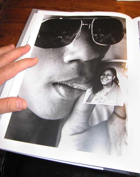
Michael Wolf: “What makes this photo great? Not only was this photo stylistically
way ahead of its time, its also up close and personal.” (note that Michael took a photo of the book because the photo is not available online)